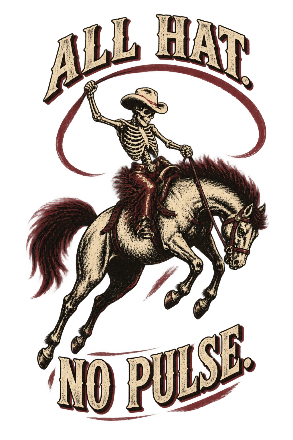
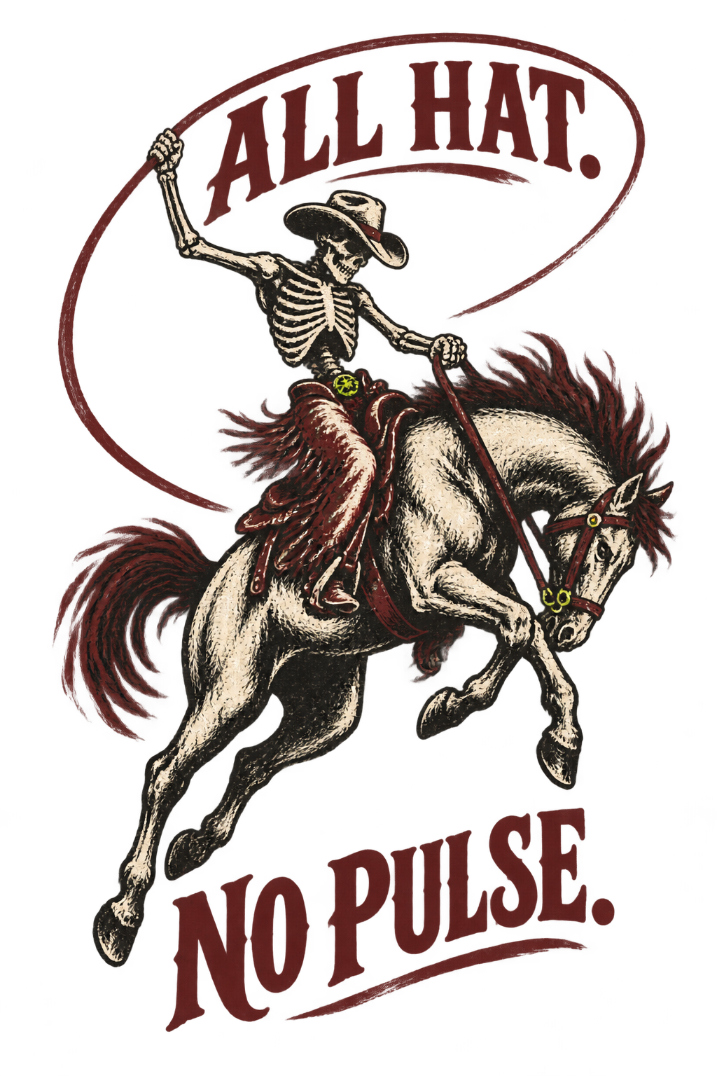
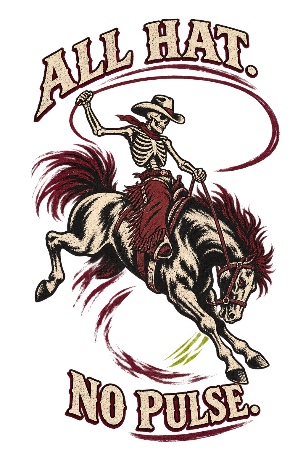
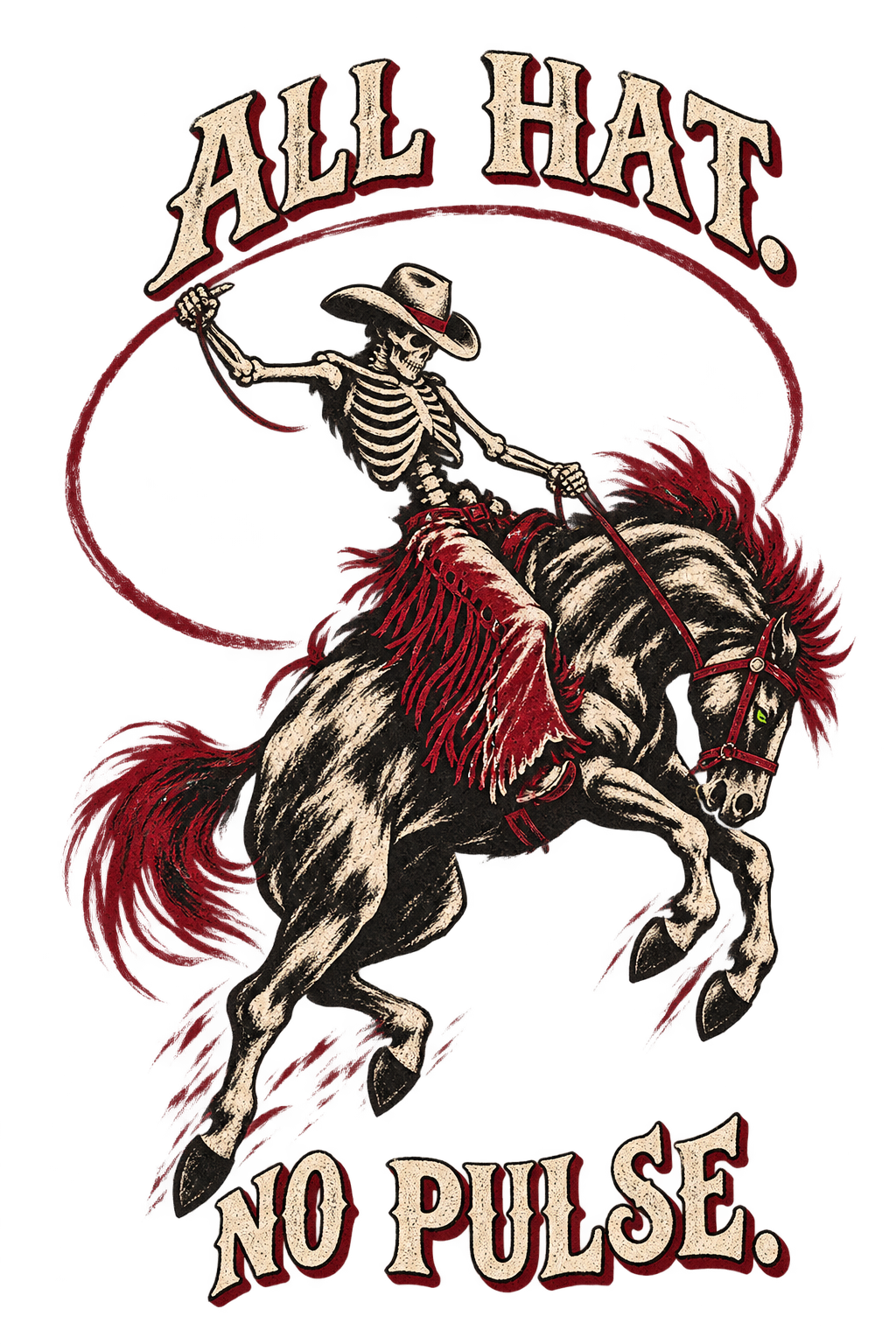
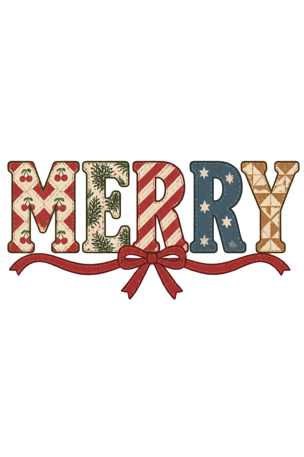
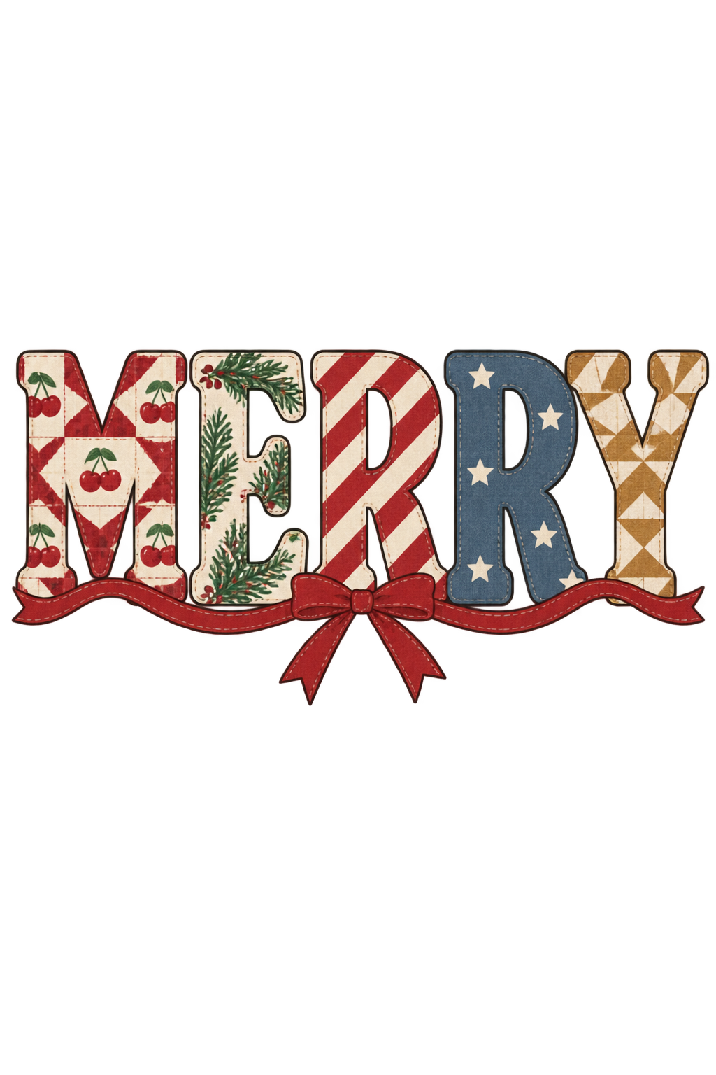
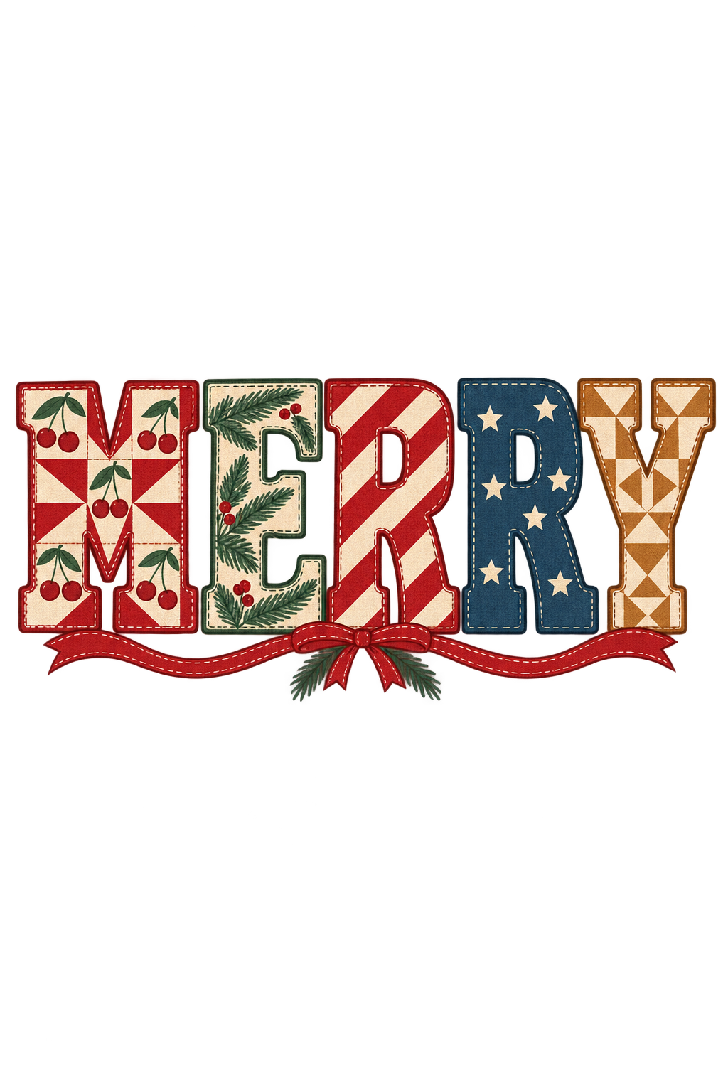
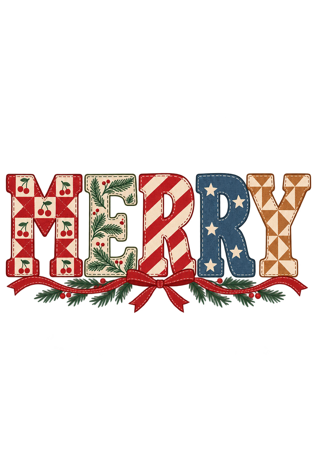
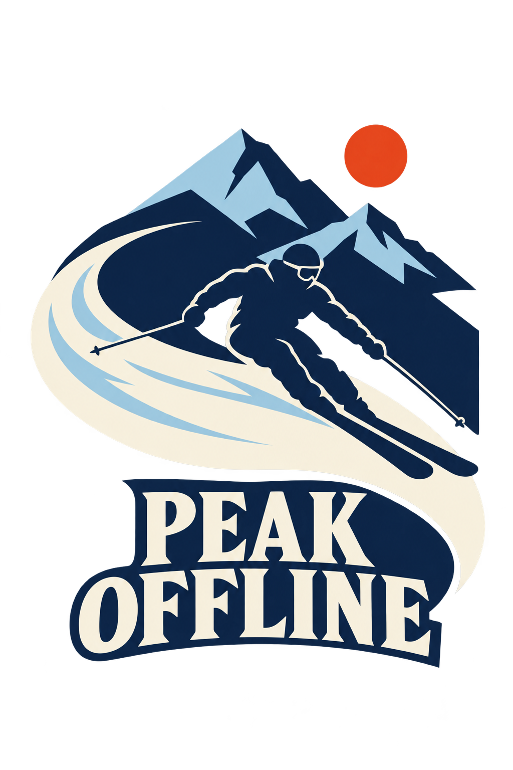
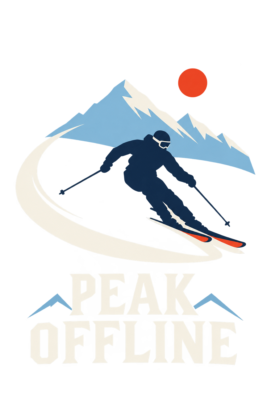
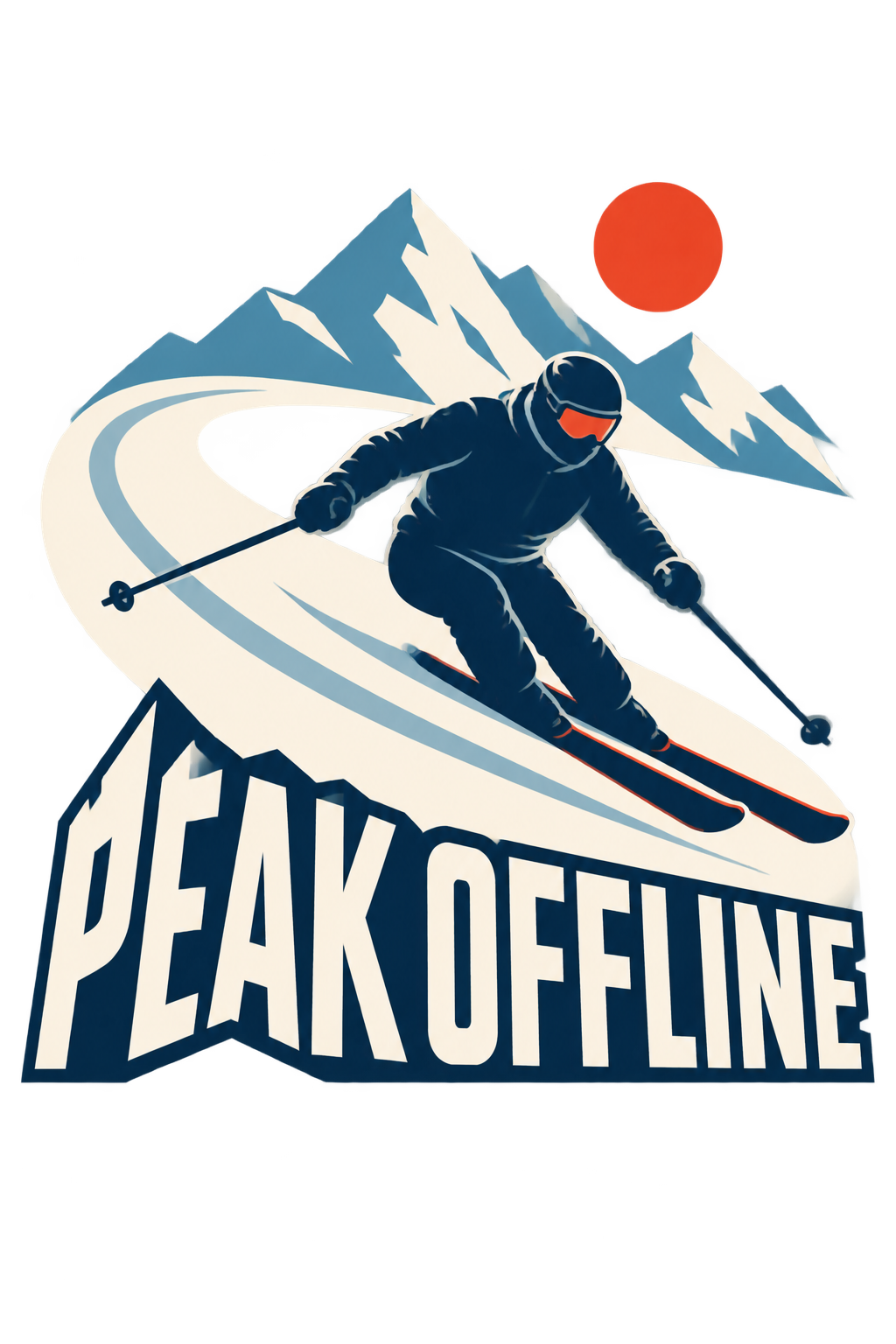
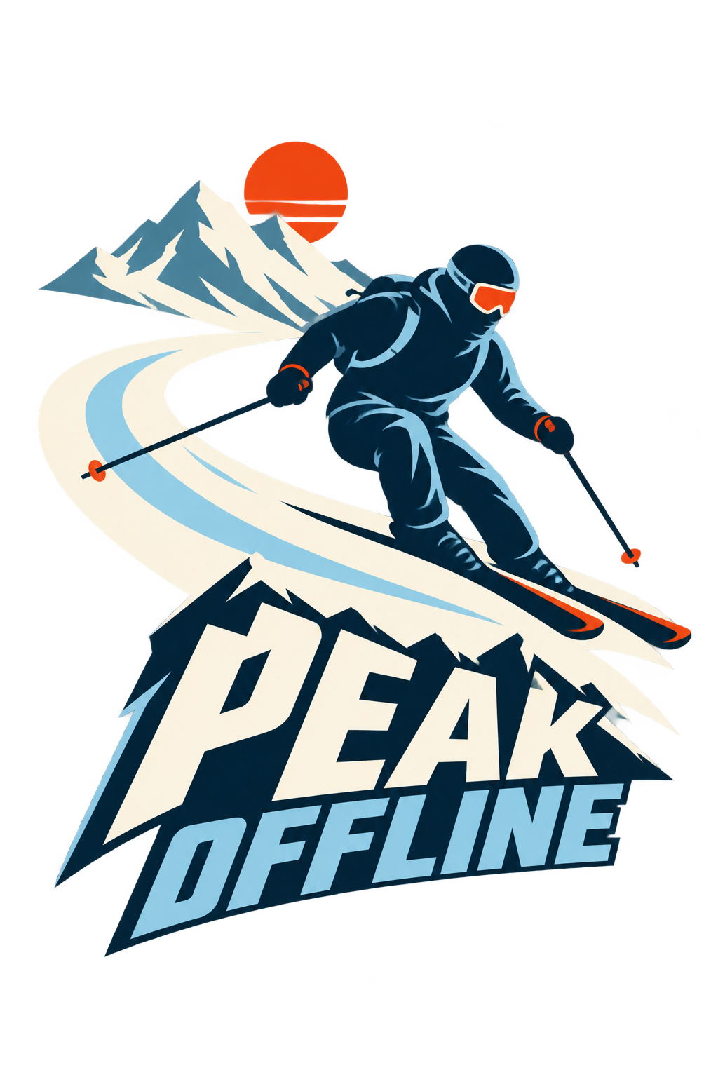
Follow the same prompt from Low to MAX. Explore the artwork side by side, then choose the detail that works for you.
The detail study
Eight prompts. All five settings. Compare Ultra Max modes.
Hover to explore at 3×. Click to open the original.
Same prompt · same size
LowMediumHighUltra HighMAX
Swipe each row to compare all five levels →
01
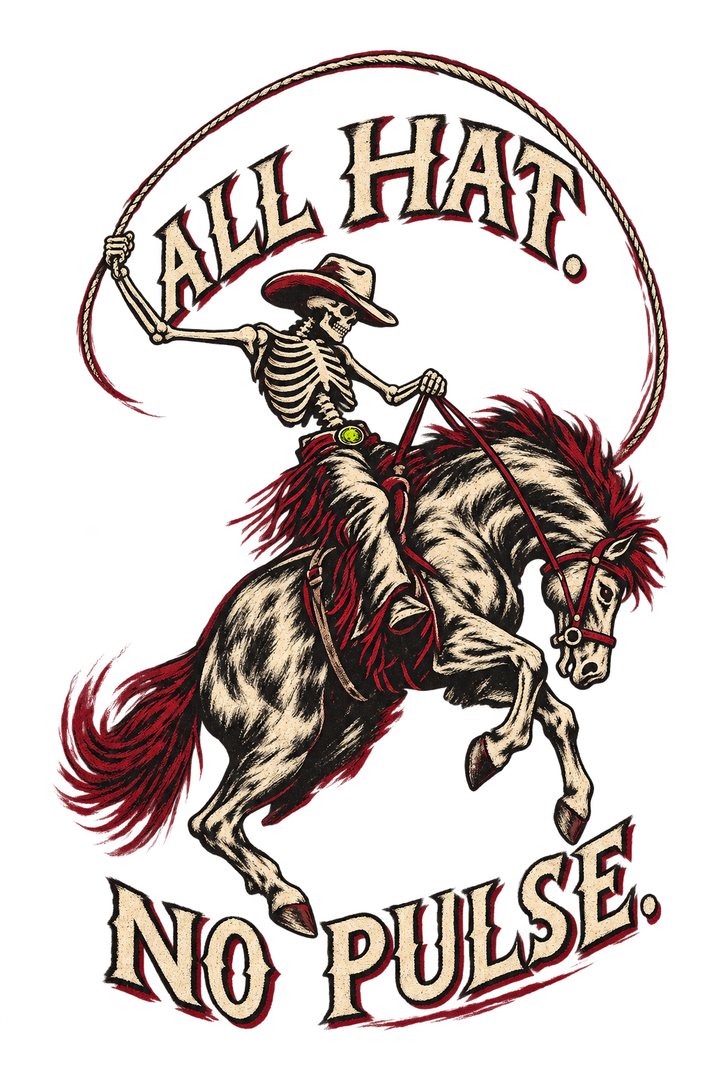
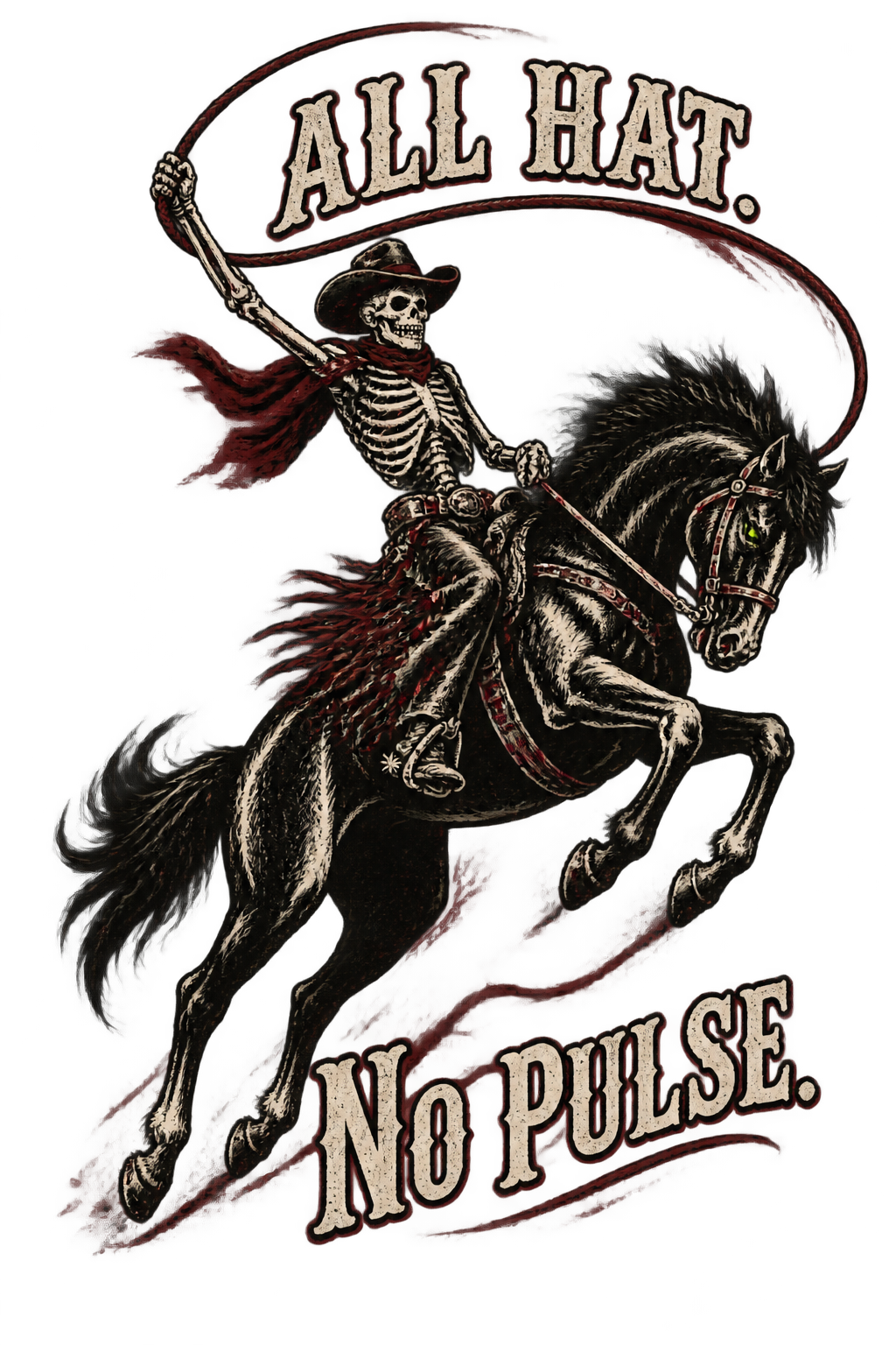
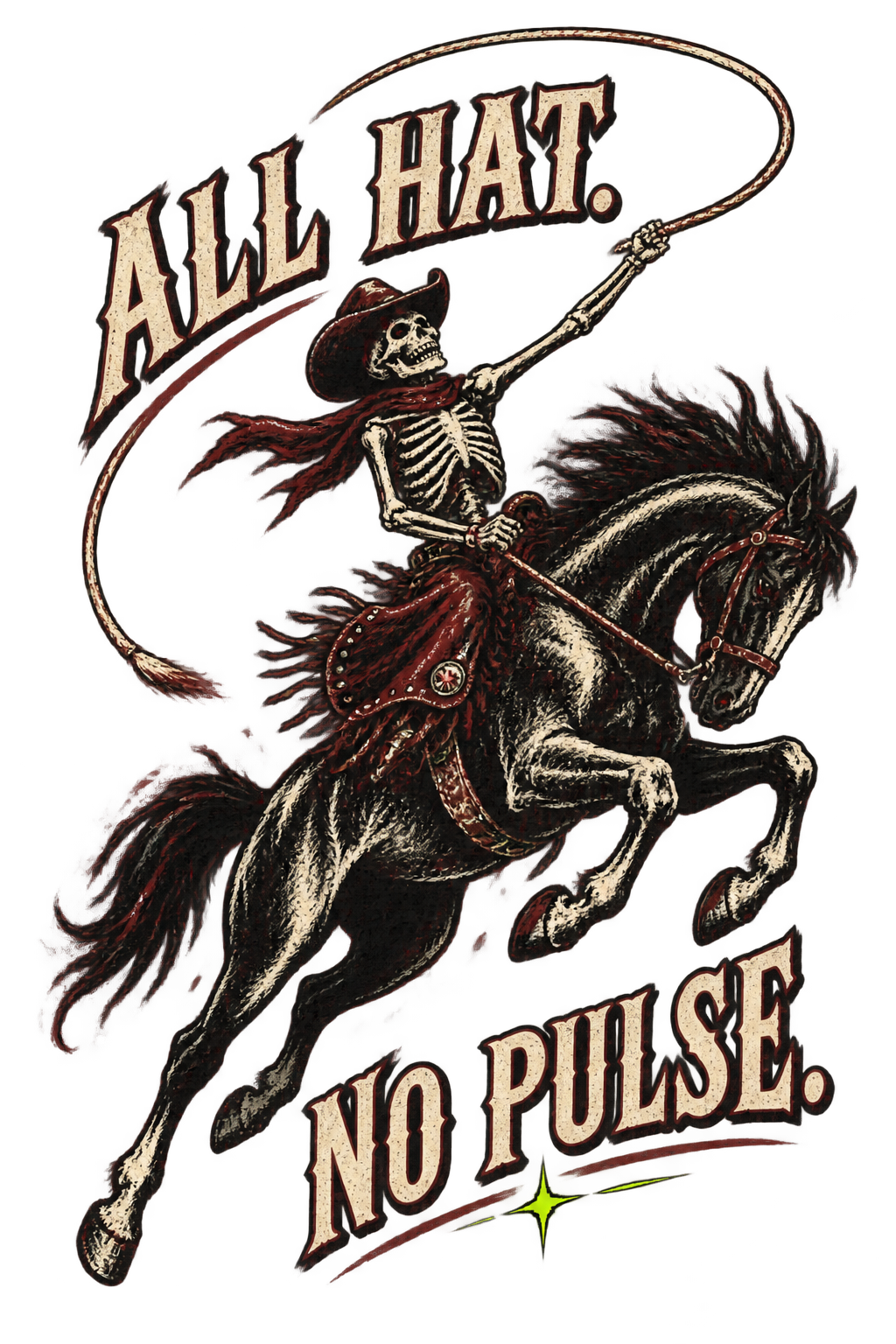
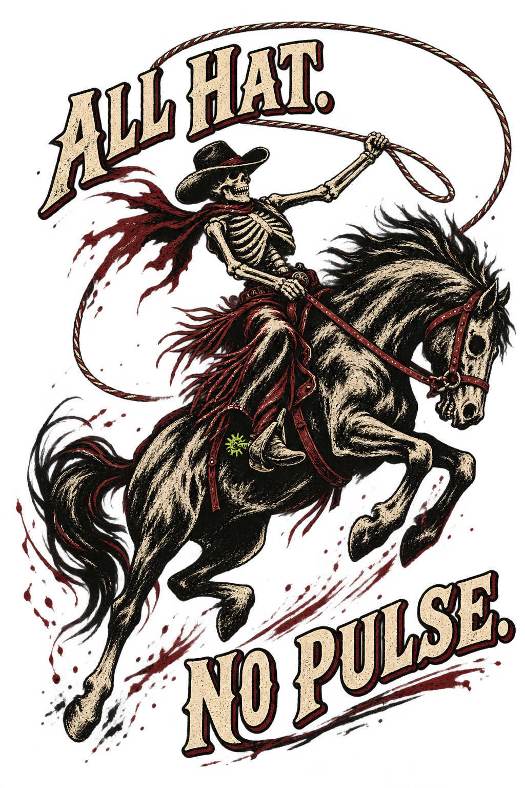
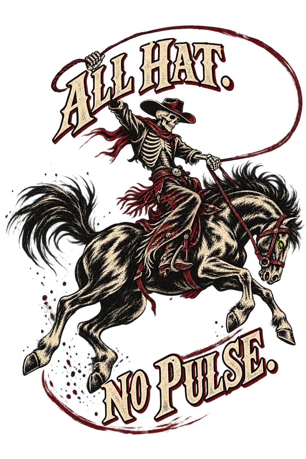
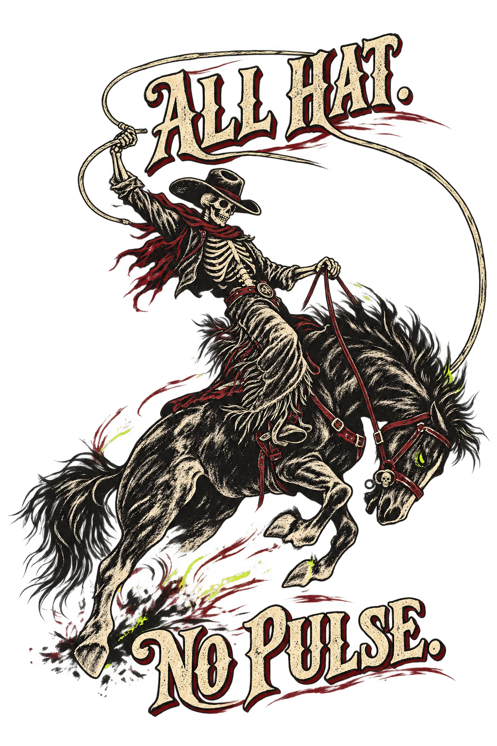
Dead Last Rodeo
1024 × 1536 Transparent artwork
Read the prompt
Create one original Halloween Western apparel illustration. Design for a charcoal mineral-wash garment as the intended application, but output artwork only. No reference photographs or sketches are supplied for this initial original-artwork candidate.
Draw a skeletal bronc rider on a powerful bucking horse moving diagonally from lower left to upper right. Use one sweeping crescent-shaped lasso to balance the composition. Make the rider's hat, ribs, hands, reins and the horse's legs readable as deliberate shapes, not tangled decoration. The anatomy is stylized, not gruesome.
Use bone as the main ink, oxblood as a secondary accent and a tiny acid-chartreuse accent. Combine bold inked contours with broad dry-brush marks. Preserve generous transparent spaces around the silhouette and between major forms. No full rectangular field.
Integrate exactly “ALL HAT.” above and “NO PULSE.” below in expressive, readable vintage rodeo lettering. No other text or numerals.
Return the isolated flat artwork only, centered with safe padding, on transparency. No shirt, person wearing a shirt, mockup, logo, watermark, decorative web corners, pumpkins, repeated badges or photographic scenery. Let silhouette and movement carry the design rather than filling every gap.
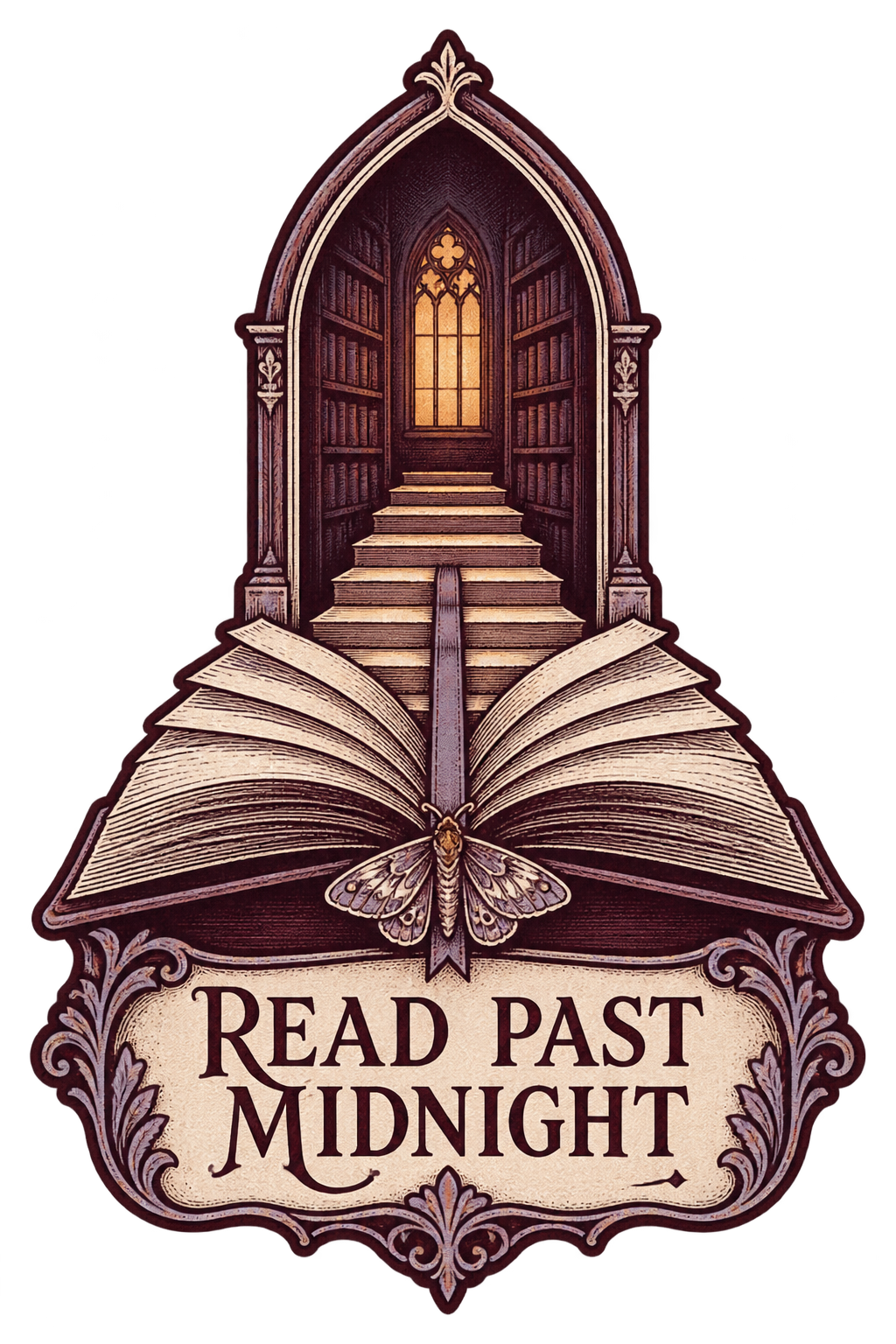
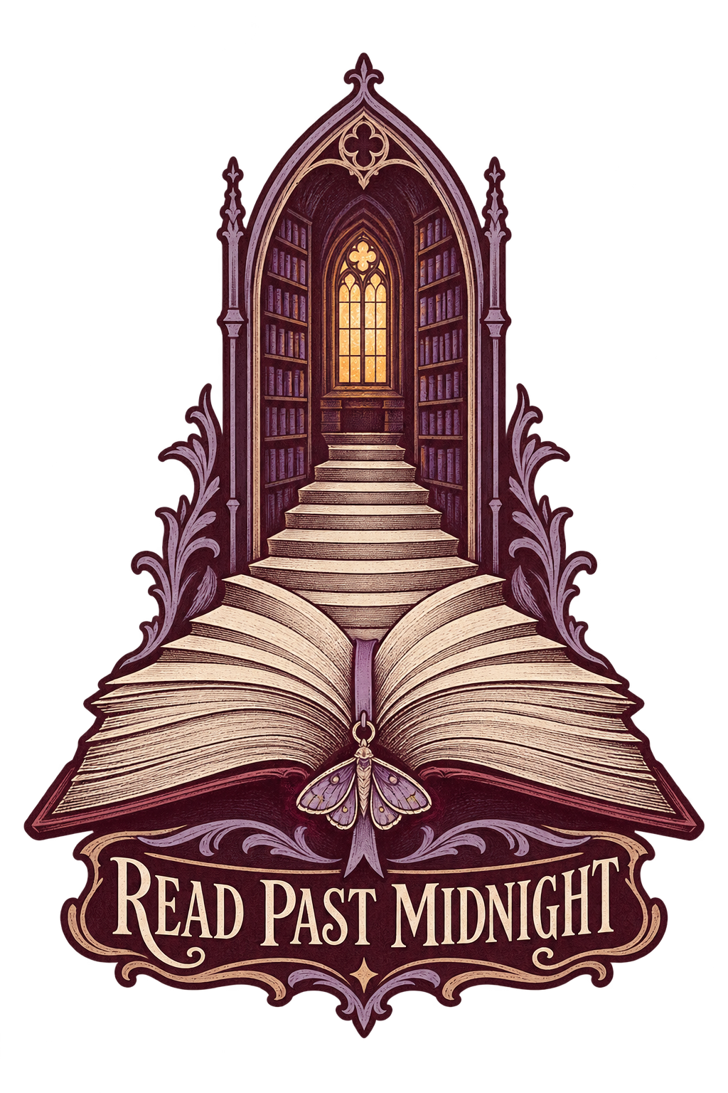
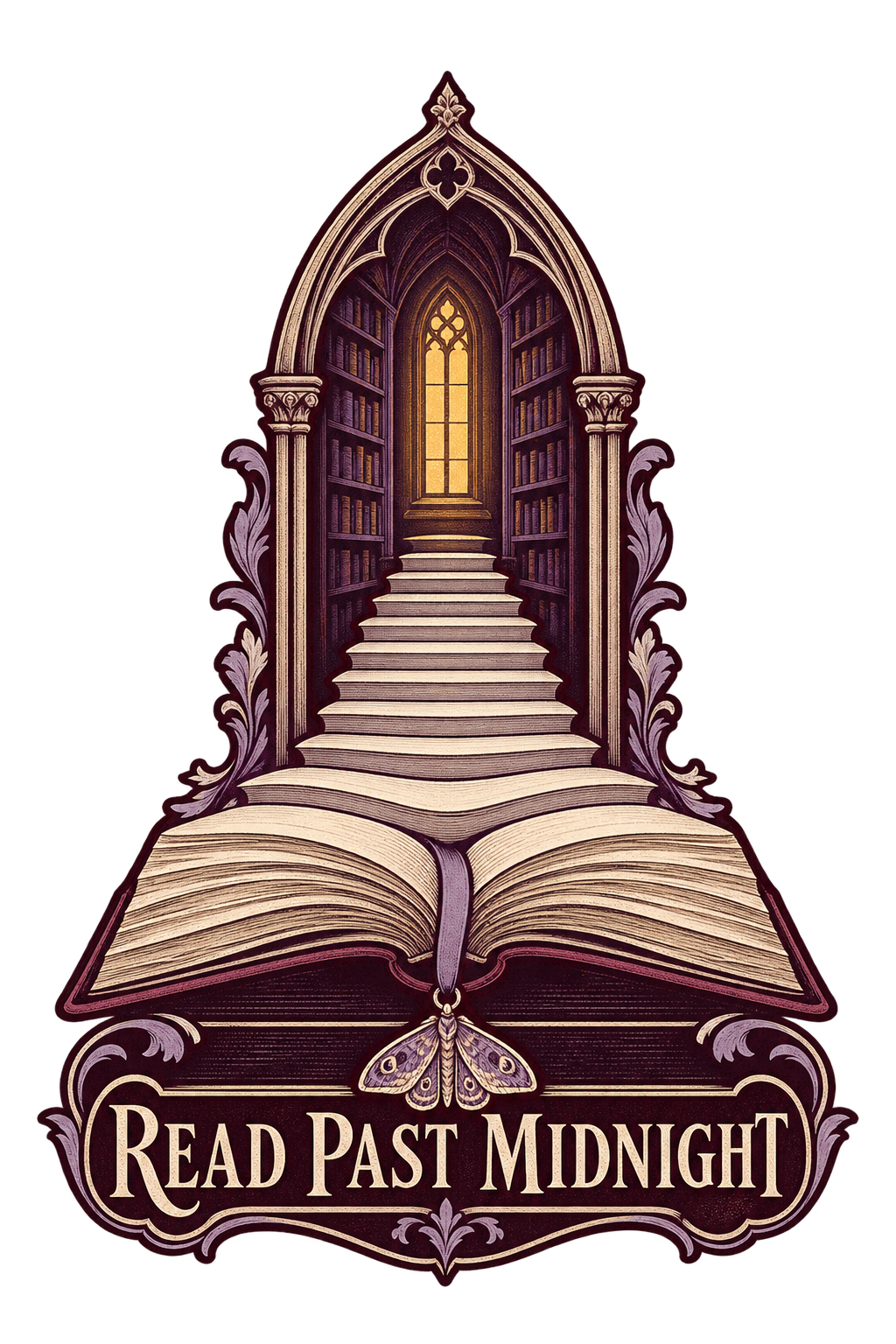
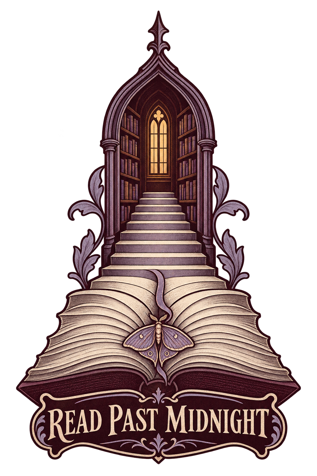
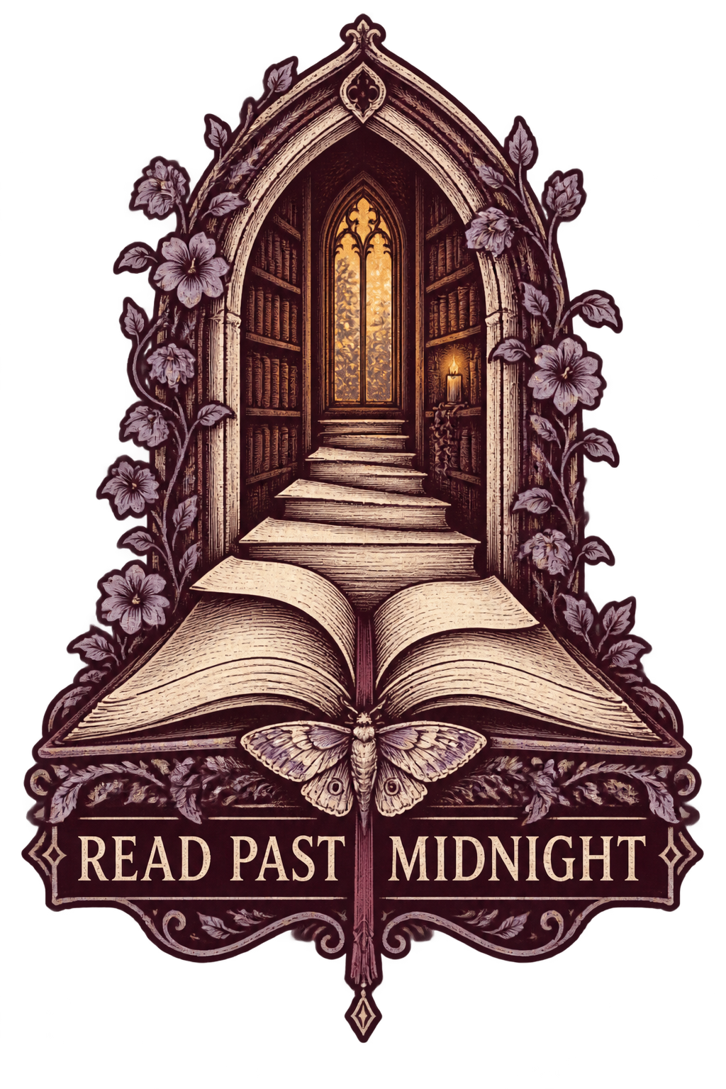
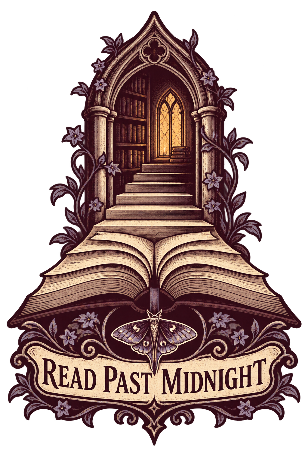
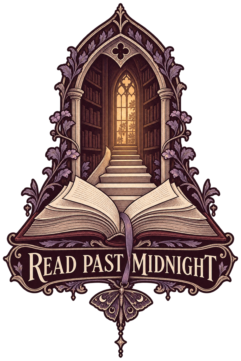
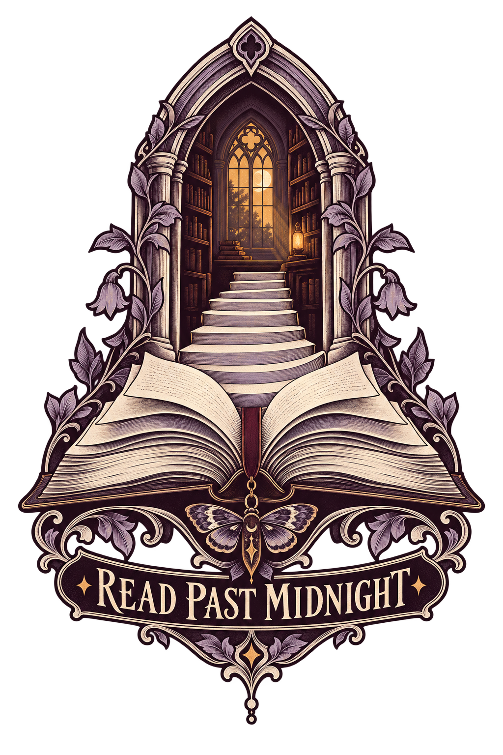
Create one original bookish apparel graphic intended for a deep-charcoal sweatshirt. No garment photograph or sketch is attached; use the described palette and composition as the complete brief. Do not render the garment.
An open book sits at the lower center. Its raised pages transform into a short staircase leading into a pointed library arch. Inside the arch is one warmly illuminated window and a suggestion of bookshelves, not a fully rendered room. A moth-shaped bookmark links the book to the arch. Make the transformation visually understandable and the outer silhouette distinctive.
Use black cherry, parchment and dusty lavender, with a restrained amber-light accent. Give the lines the character of an engraved bookplate while keeping the structural contours substantial and the background open. Reserve fine detail for a few focal areas.
Render exactly “READ PAST MIDNIGHT” once in elegant, readable display lettering integrated with the lower bookplate structure. No additional quotes, dates or fictional-world symbols.
Return only the isolated artwork on transparency with safe padding. No garment, room photograph, full dark rectangle, famous book cover, licensed character, watermark or loose cloud of decorative stars.
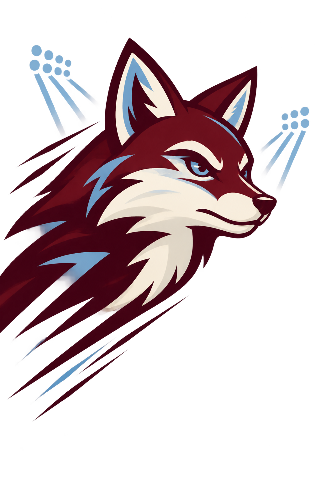
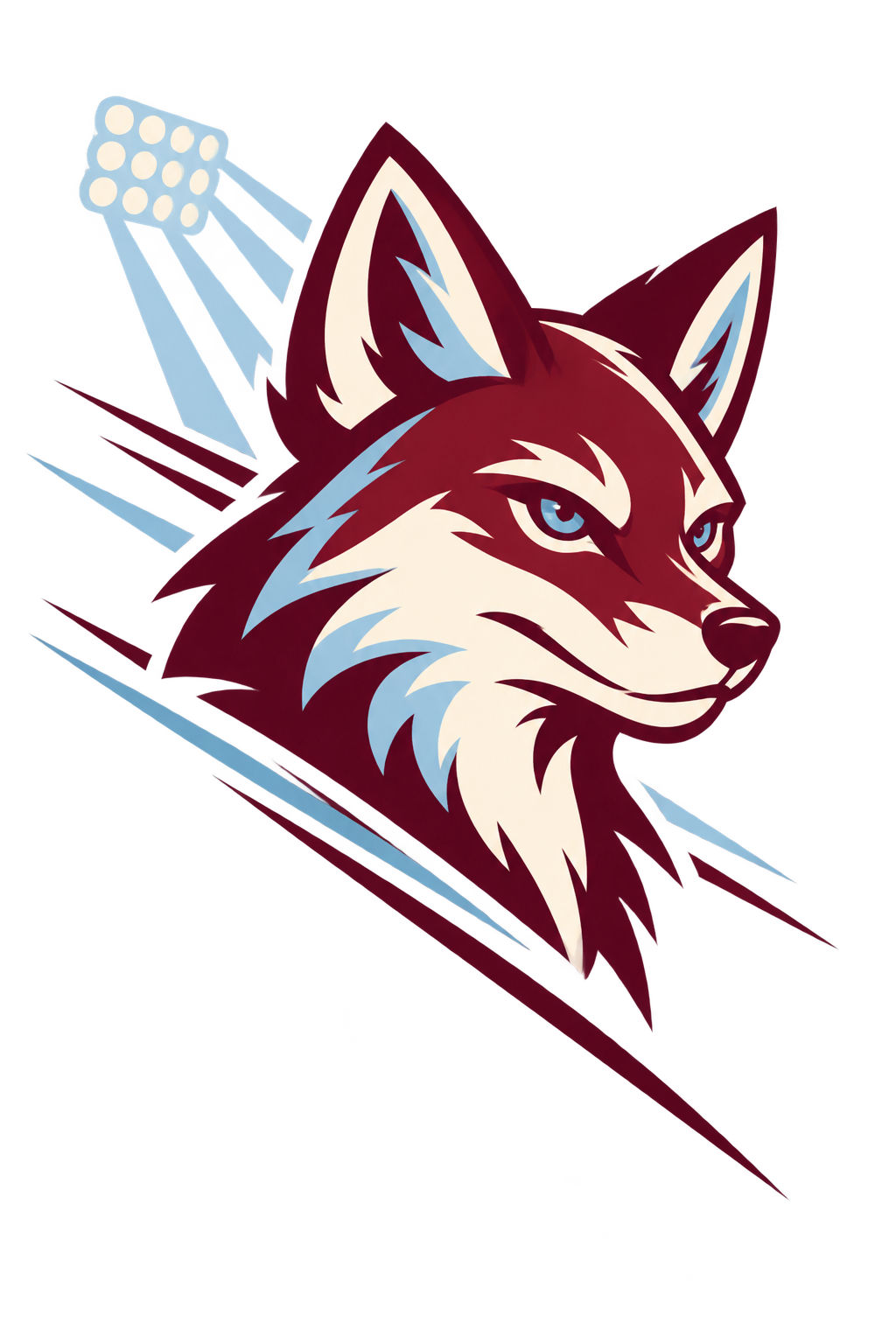
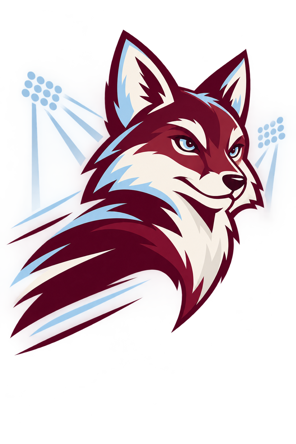
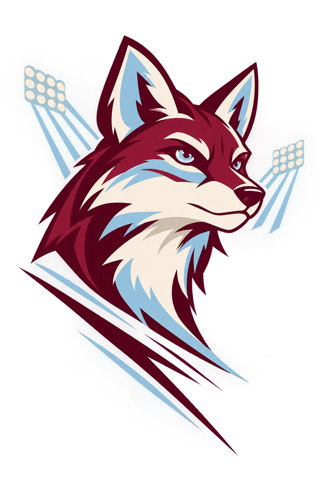
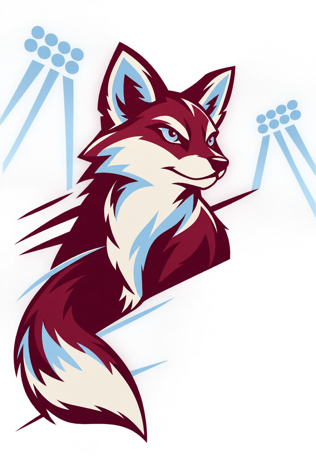
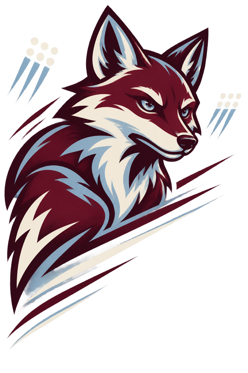
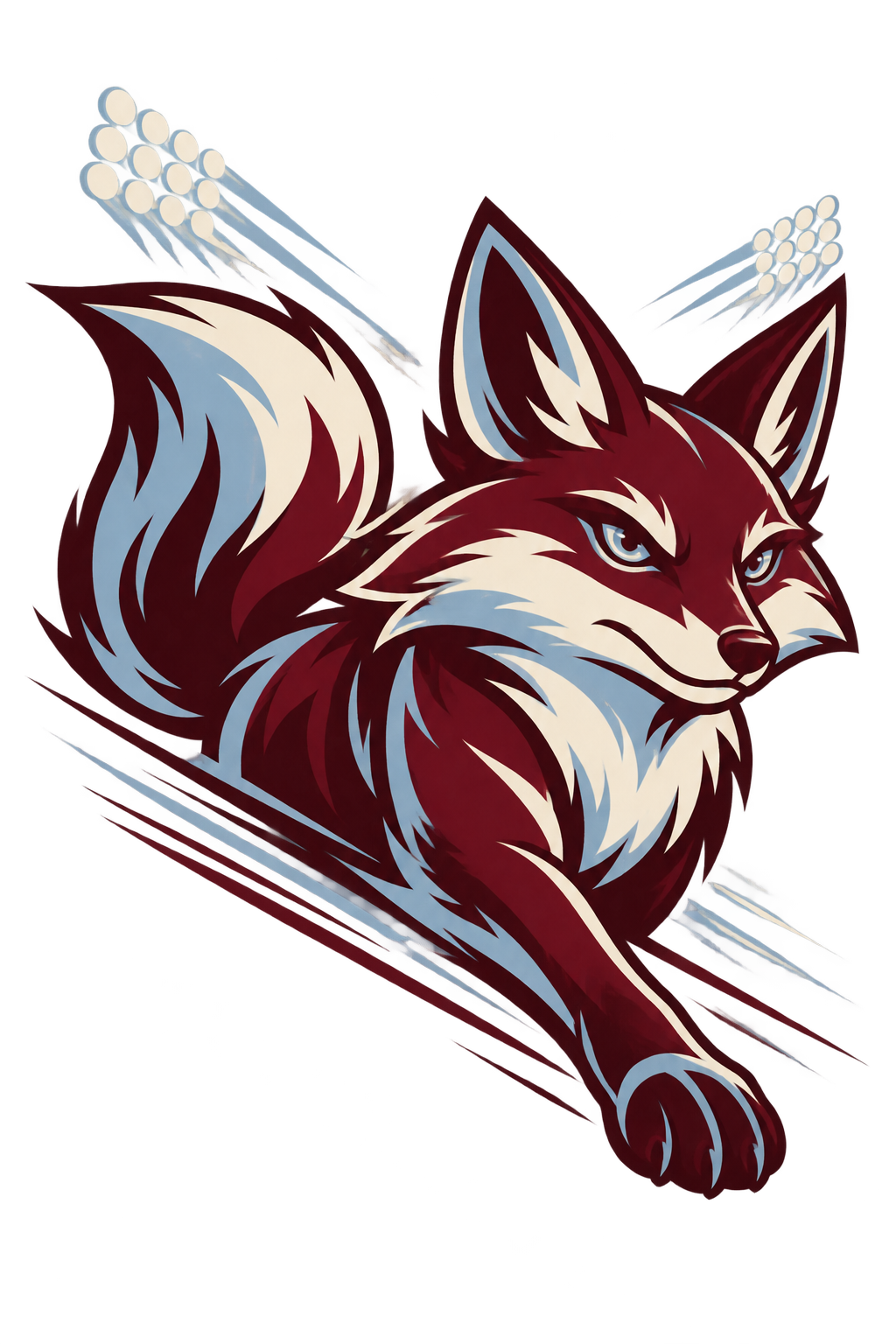
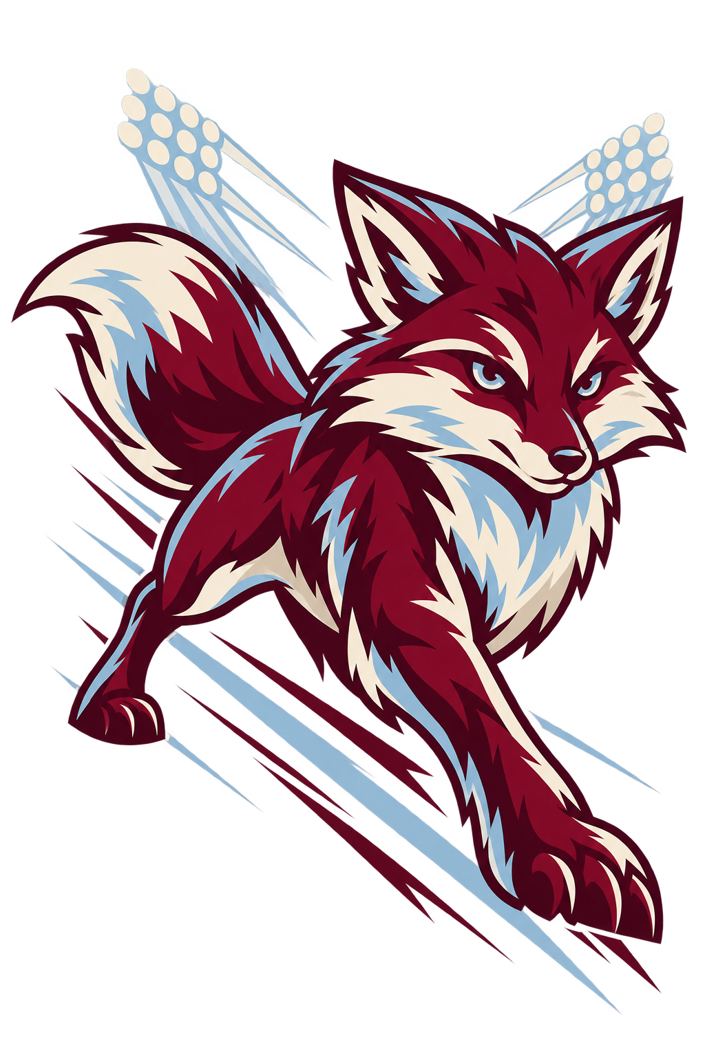
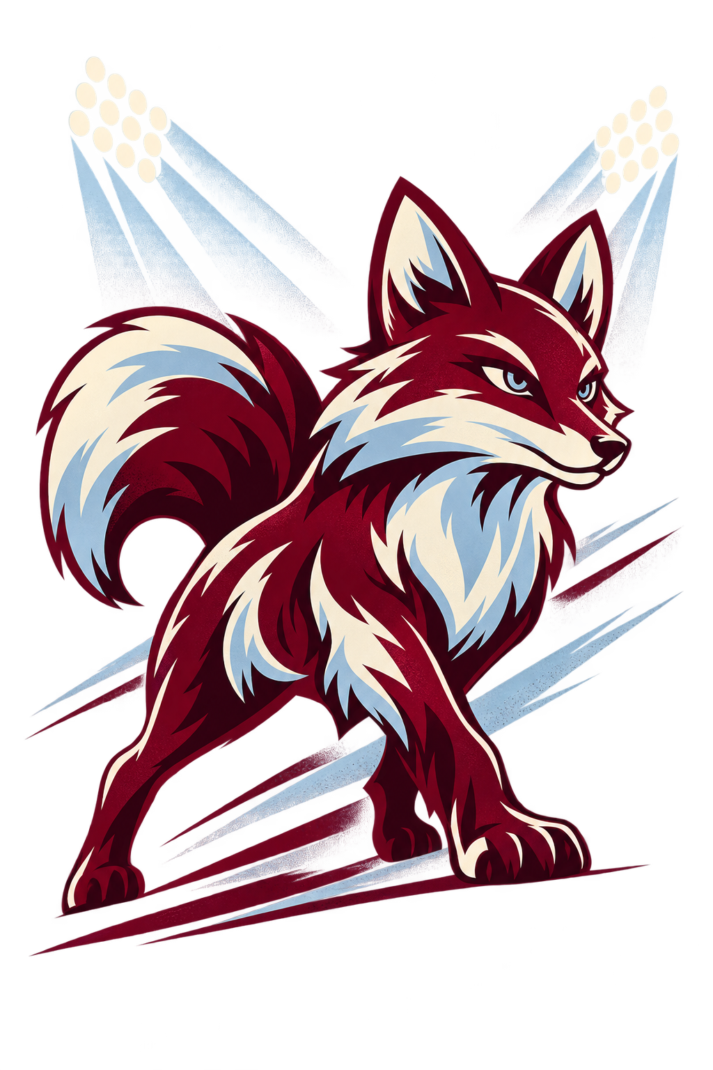
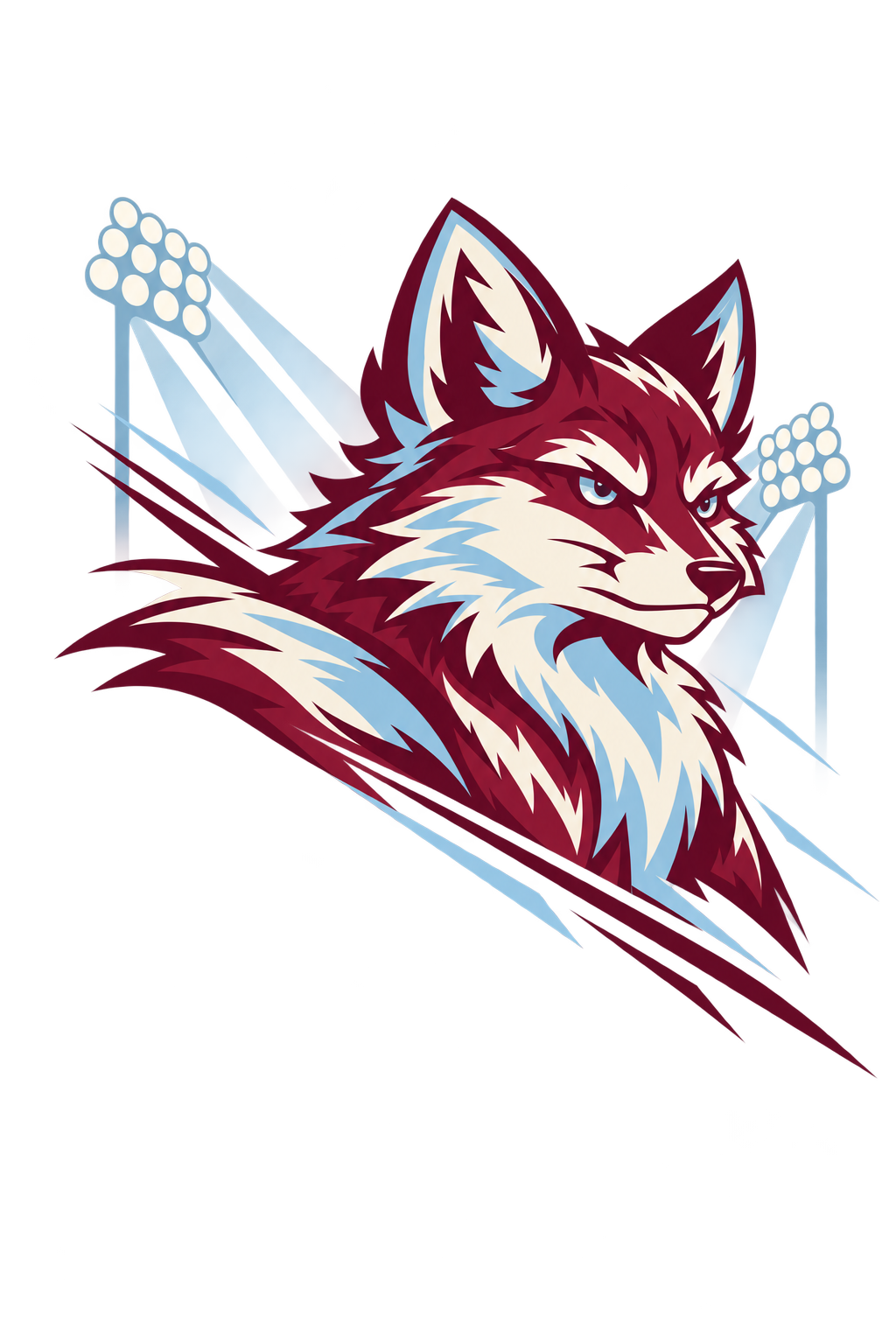
Create one original fox mascot illustration for a clearly fictional studio-demo school identity called Hollow Creek Foxes. No existing logo, real team, garment photograph or identity reference is supplied. Establish a distinctive compact fox silhouette with pointed ears, an alert confident expression and broad geometric cheek shapes. Use burgundy, frost blue and bone. Do not imitate a professional or school team logo. This is original demo artwork, not preservation of an existing identity.
Build a forceful diagonal arrangement with a large mascot focal shape, a few controlled speed lines and a sparse suggestion of stadium light beams. The aesthetic is premium hometown spiritwear, not a photographic stadium collage. Use burgundy, frost blue and bone .
Leave intentional, clean space for the exact team name and any player number to be added as editable typography. Do not generate names, numbers, slogans, badges or a replacement official logo. Treat the original demo mascot as a concept requiring identity review, not as an exact logo file.
Return only the isolated supporting artwork on transparency, with safe margins and open dark areas supplied by the garment. No shirt, mockup, people, watermark or photographic backdrop.
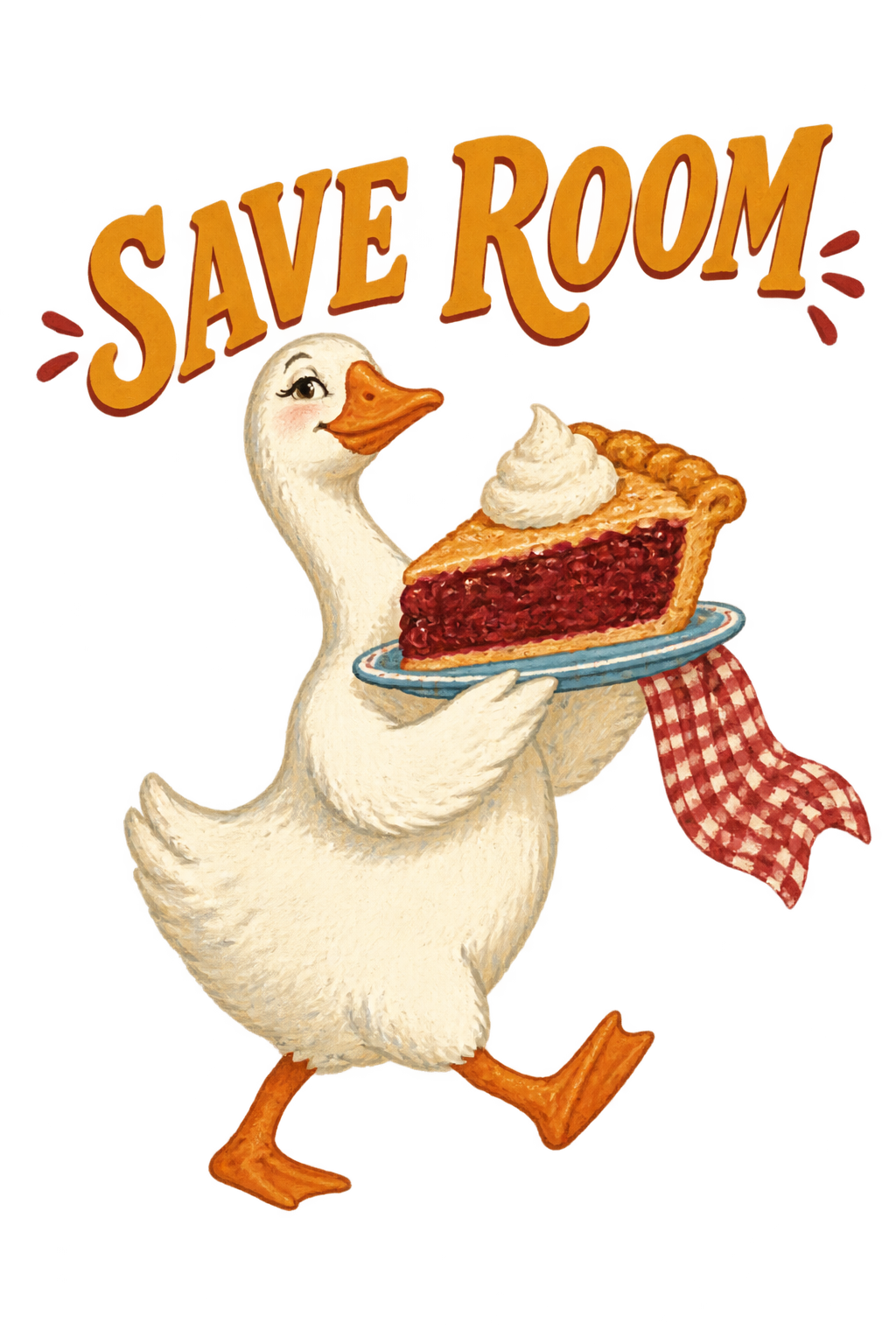
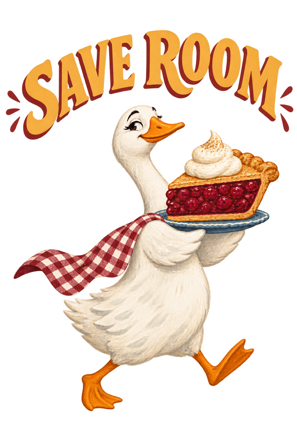
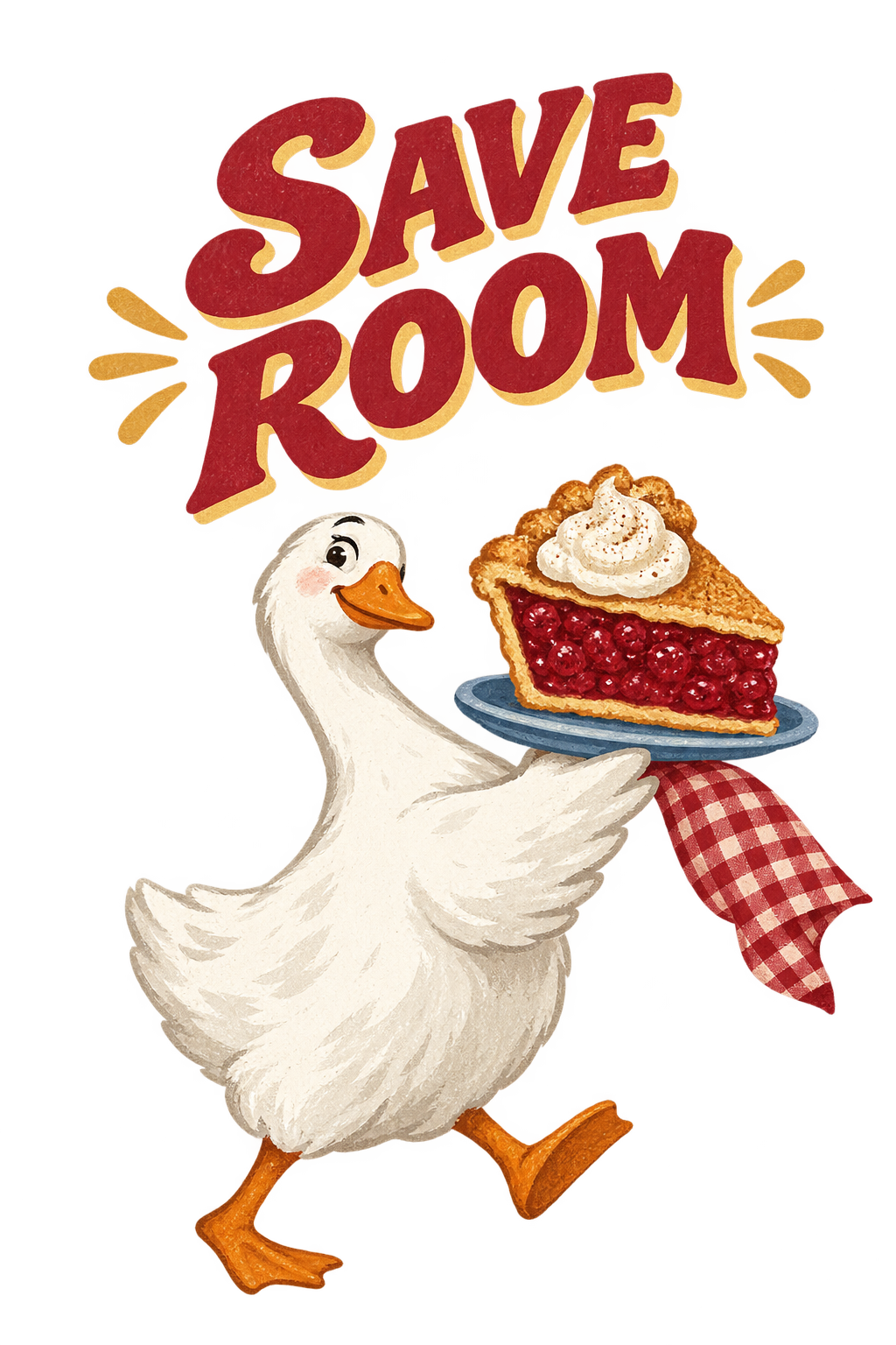
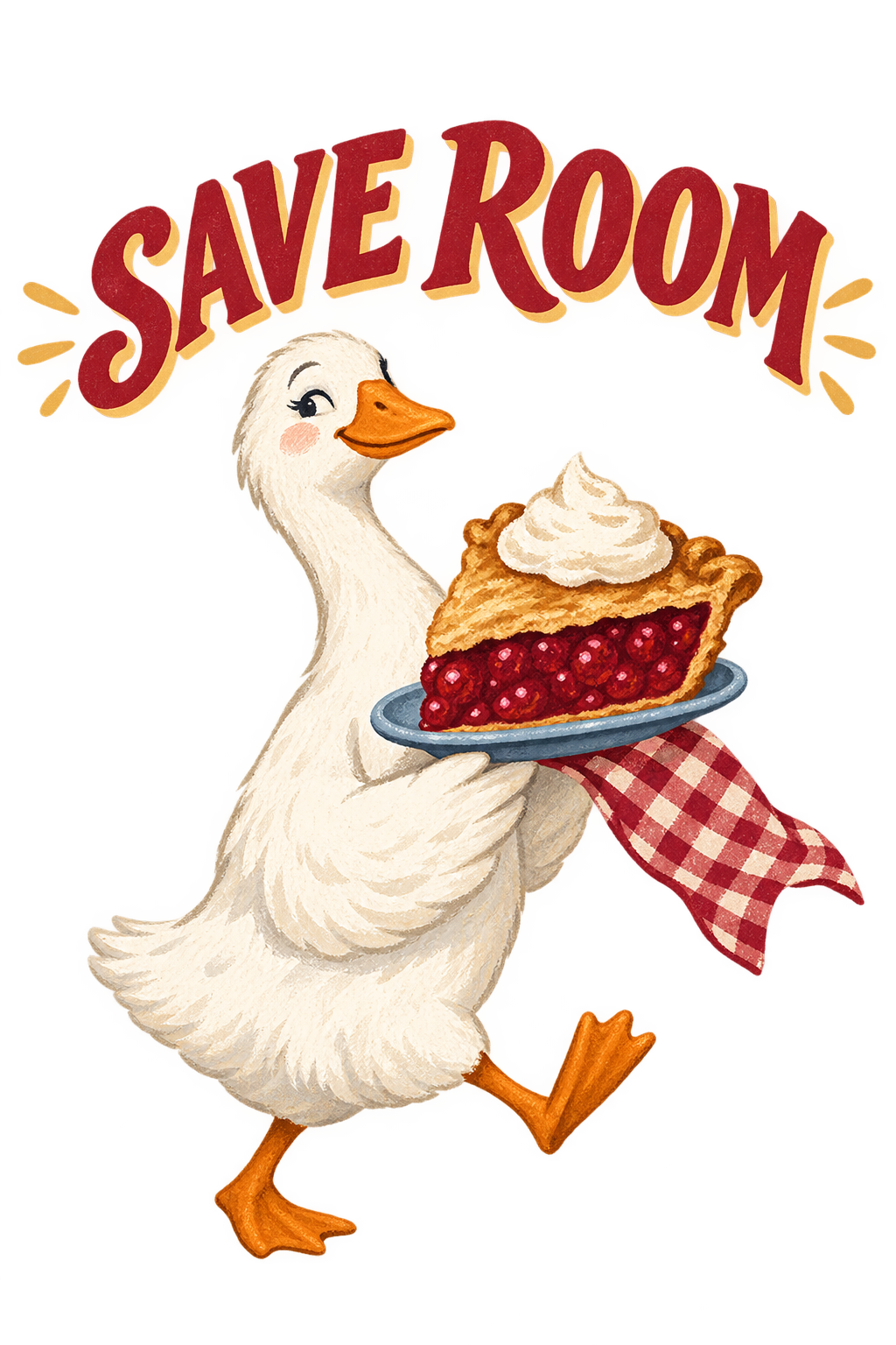
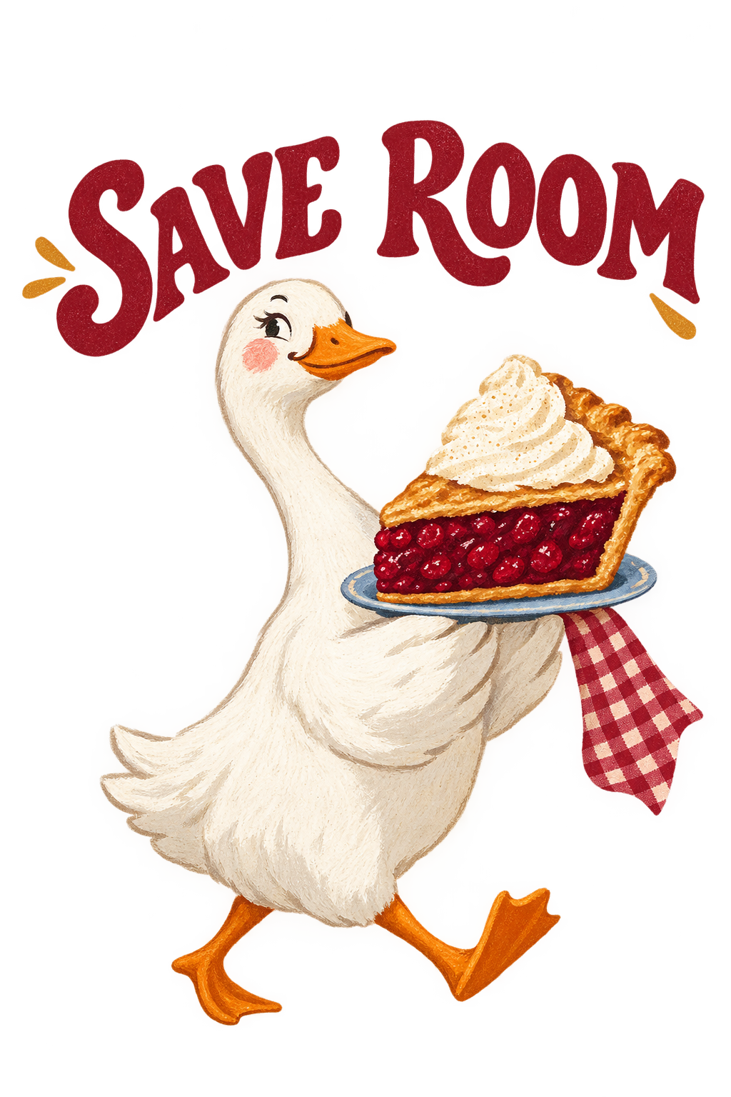
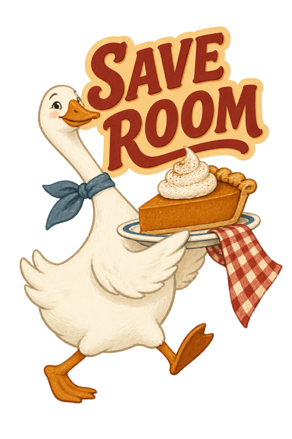
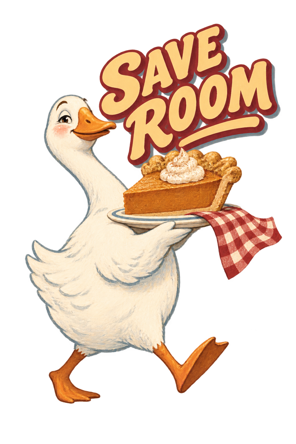
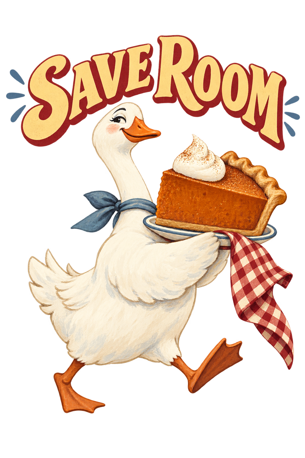
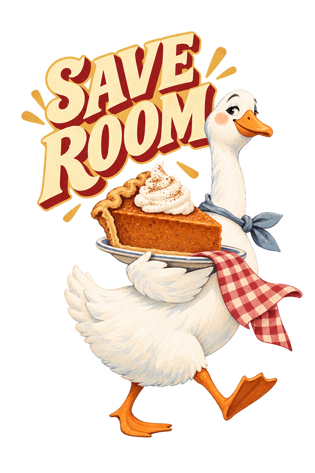
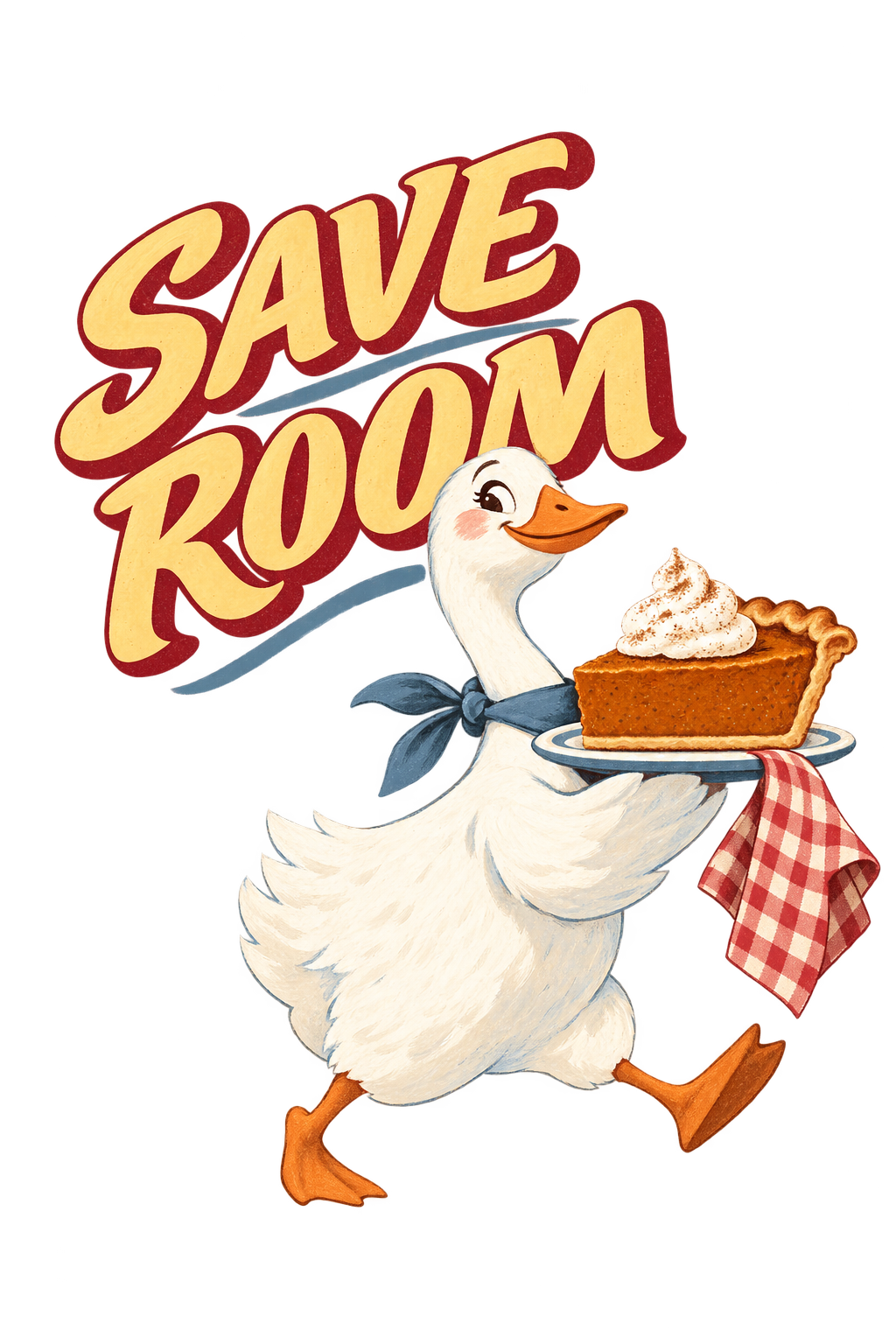
Create an original funny autumn apparel illustration intended for a natural or butter-toned tee. No garment reference is attached; output artwork only.
The central character is a self-satisfied white goose walking quickly away with an absurdly generous slice of pie on a small platter. Its posture should tell the joke: chest proud, one foot lifted, head turned slightly toward the viewer. One gingham napkin trails from the platter. Keep the character charming, specific and new rather than resembling an existing cartoon.
Use butter yellow, cranberry, cocoa and one restrained dusty-blue accent. Combine broad gouache-like painted shapes with a little printed texture. Keep the white body, pie filling and platter clearly separated. Make the pie and goose read immediately from a small preview.
Integrate exactly “SAVE ROOM” once in large, warm mid-century food-ad lettering. No other words or holiday date.
Return the isolated flat illustration on transparency with generous outside padding. No shirt, table scene, decorative autumn border, turkey, pumpkin collage, watermark or generated logo.
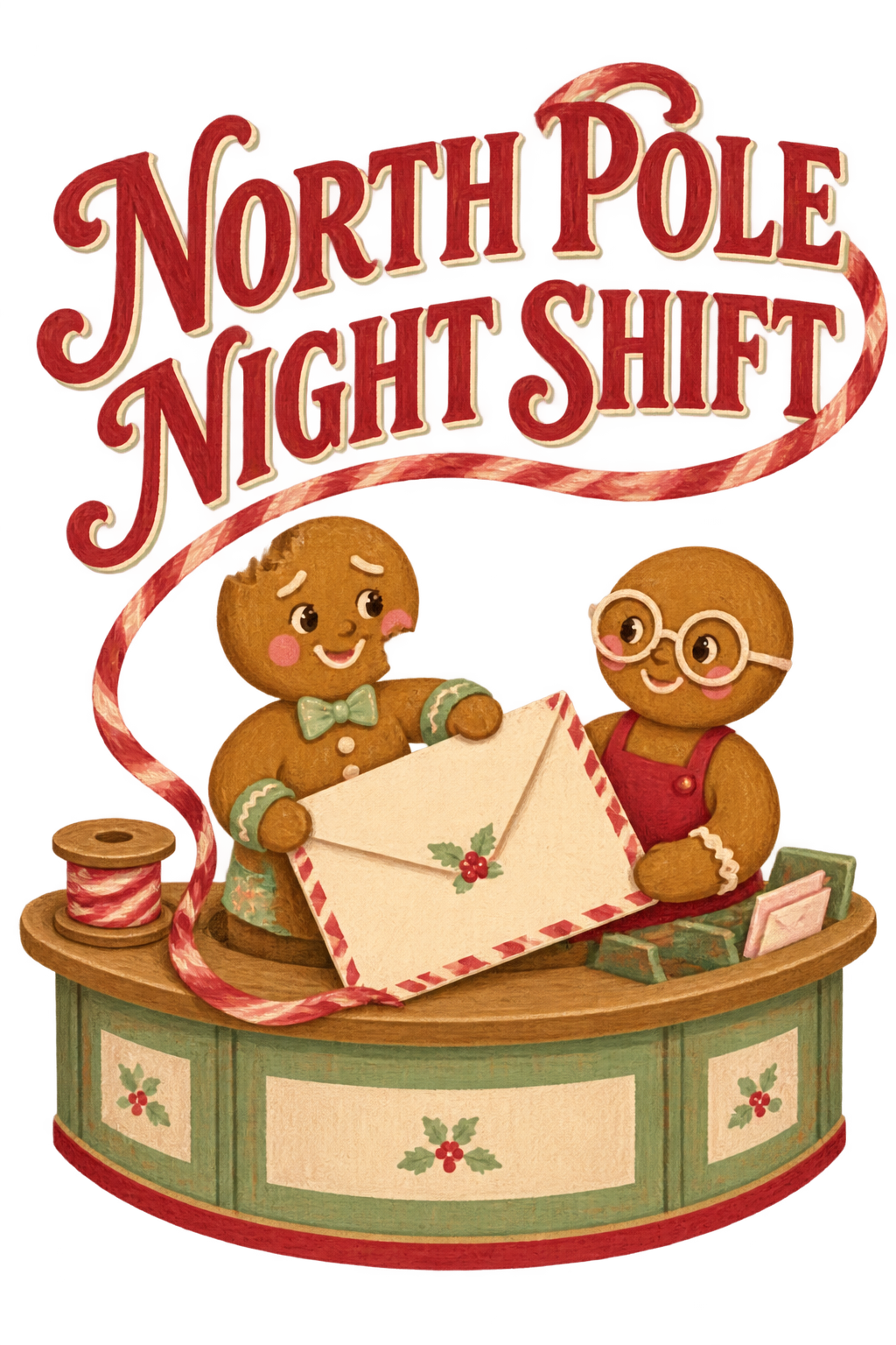
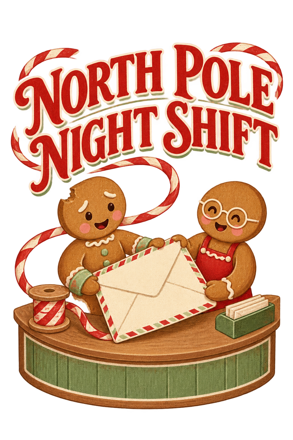
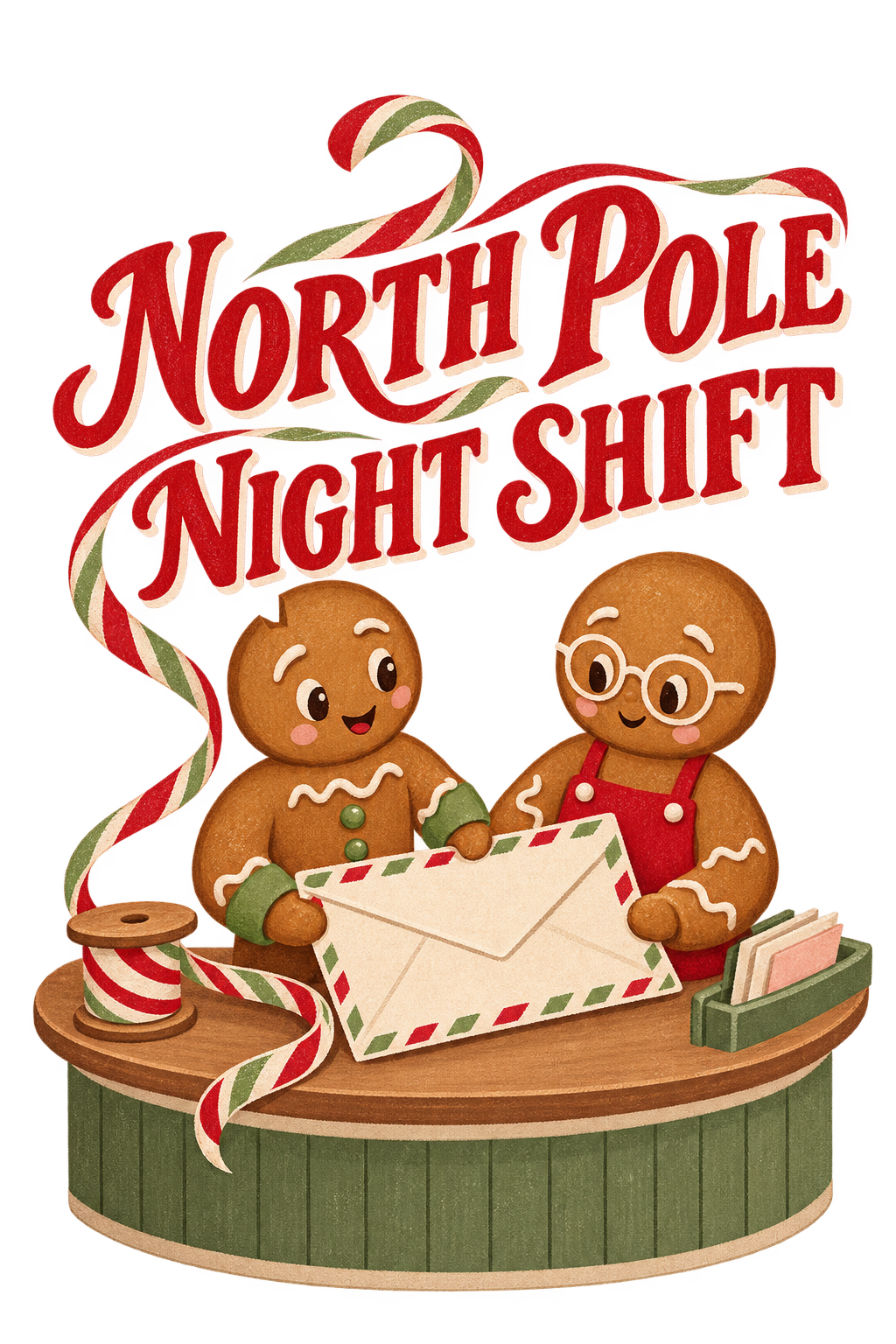
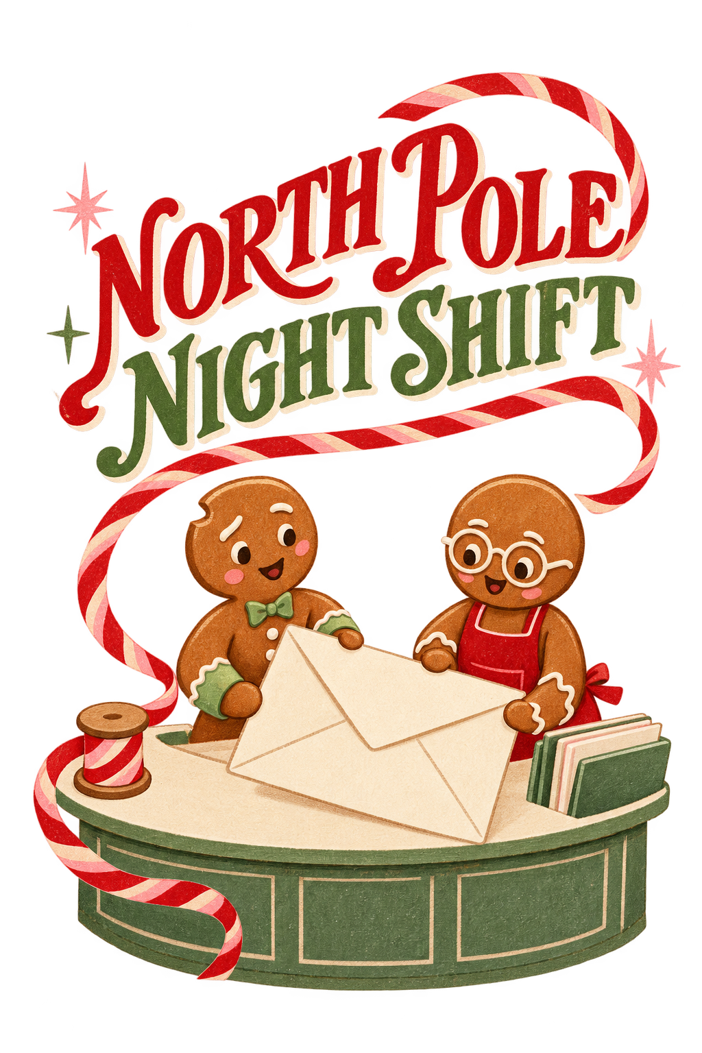
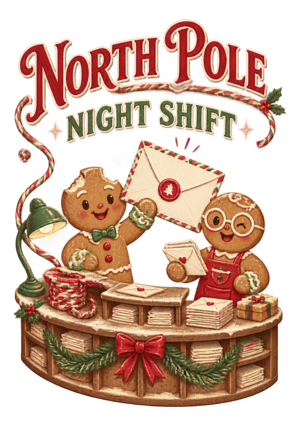
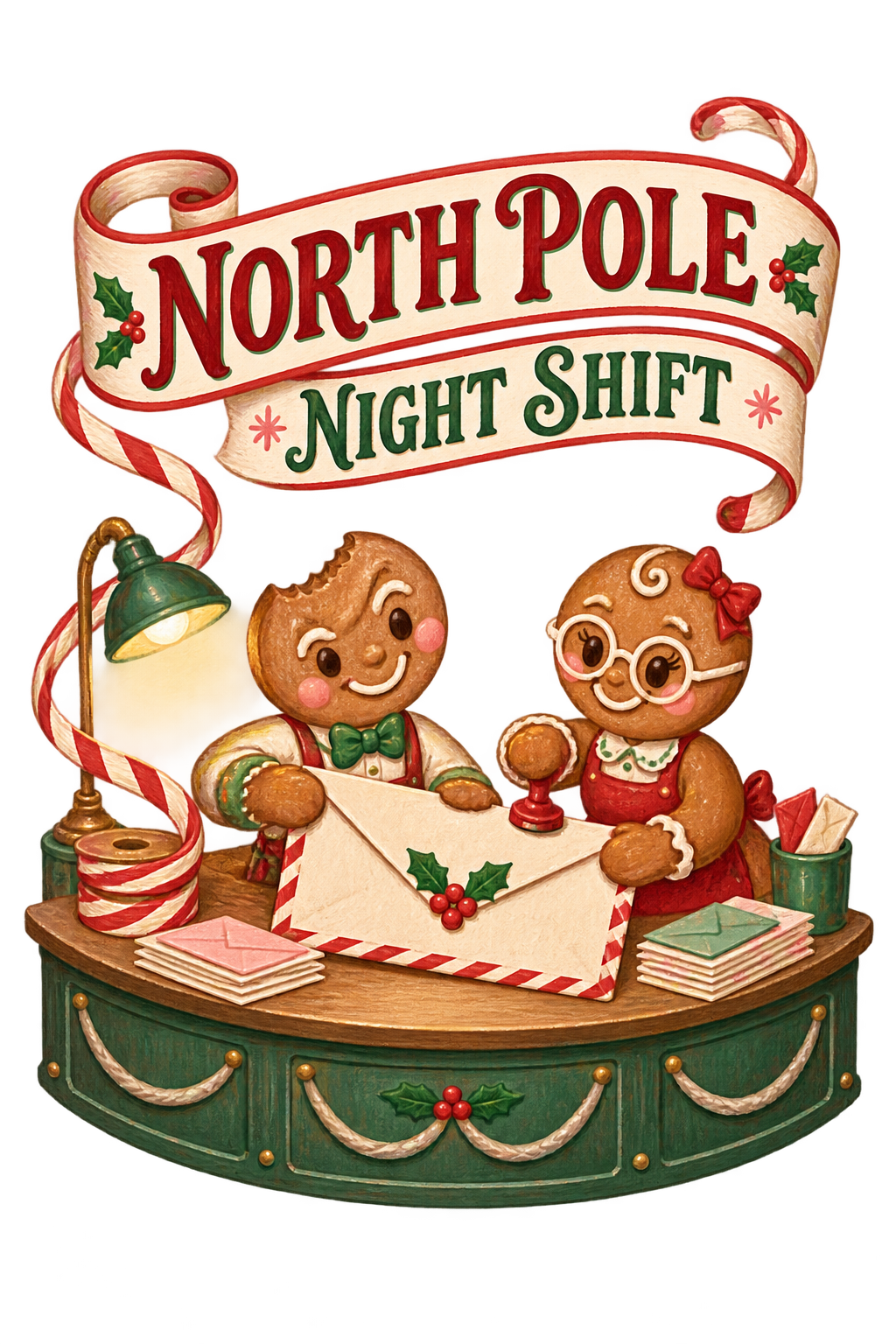
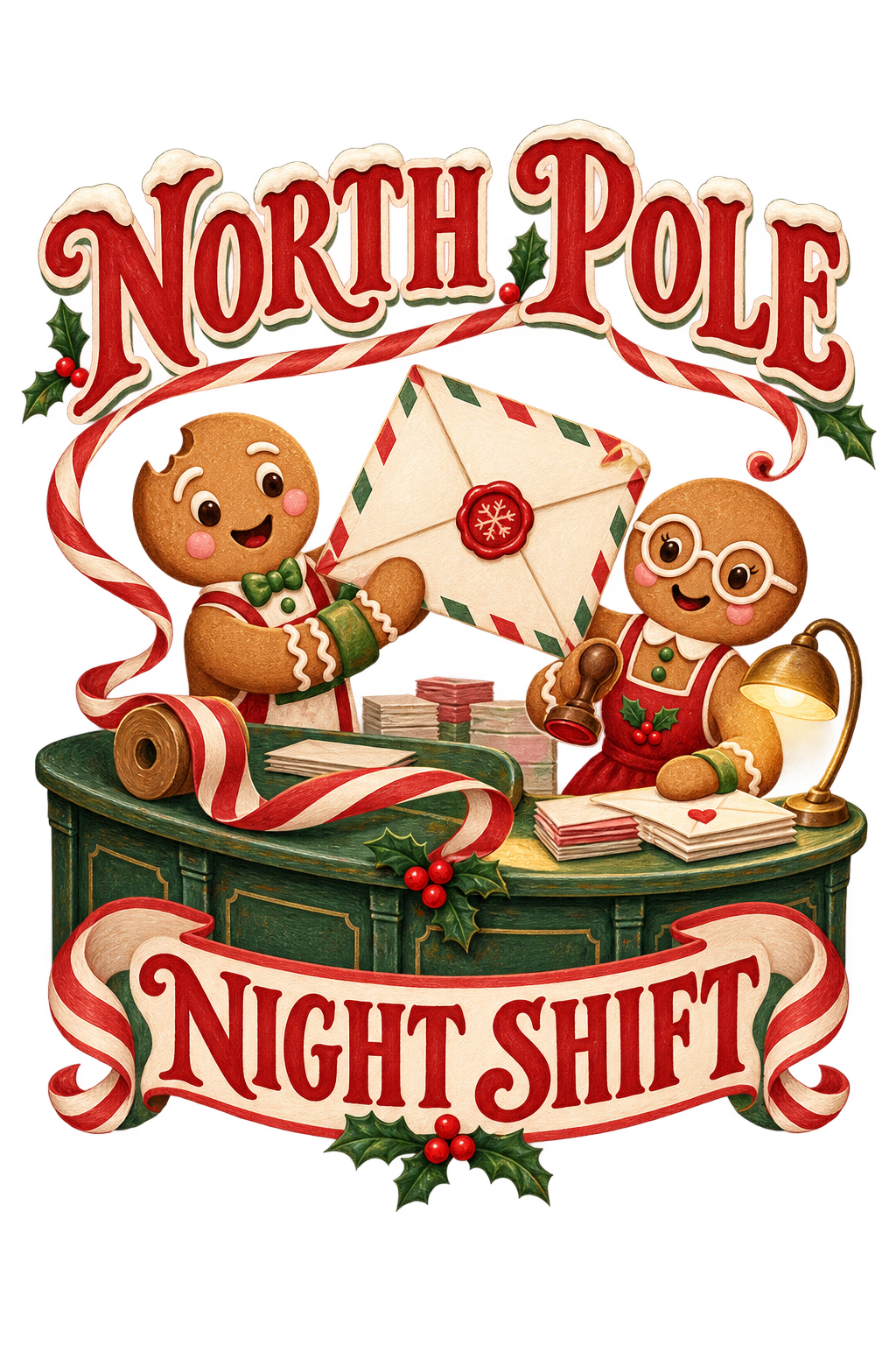
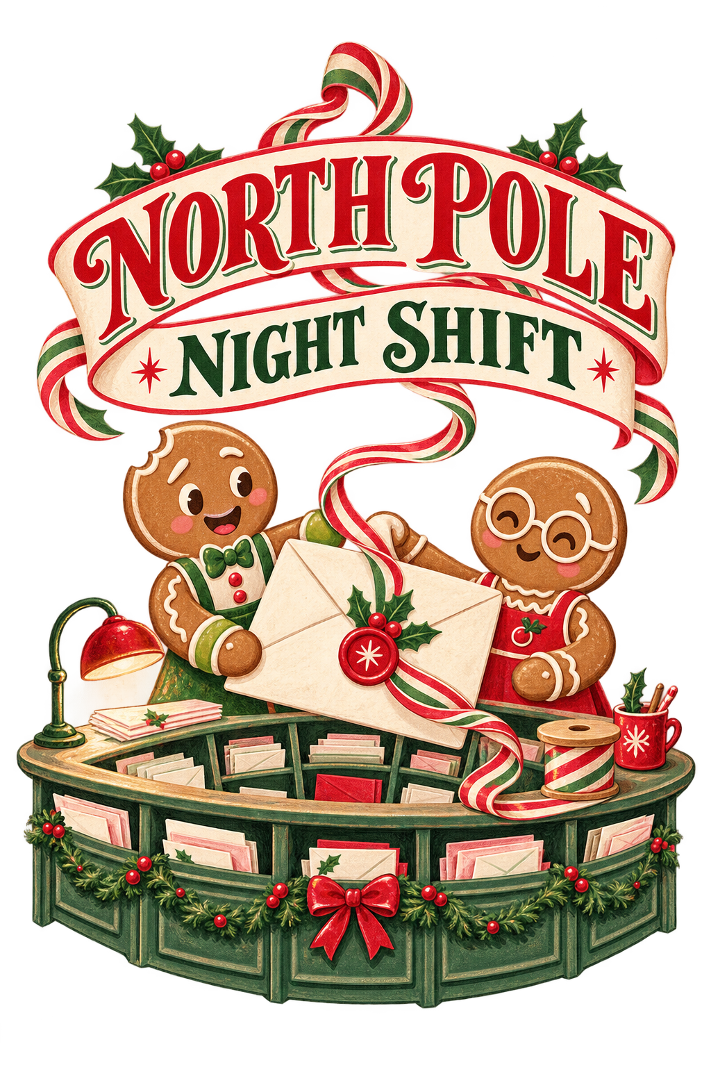
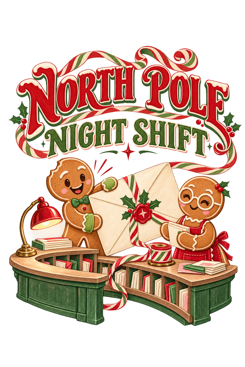
Create one original Christmas apparel illustration intended for a cream sweatshirt. No garment reference is supplied for this initial original-artwork candidate. Do not include the garment in the output.
Illustrate a tiny North Pole mailroom working late. Use one curved sorting desk, two expressive gingerbread postal workers and one oversized envelope as the main composition. One worker has a small triangular notch on the upper-left edge of its cookie head, pistachio cuffs and raised icing eyebrows. The other has round icing spectacles and a cherry-red apron. Keep both silhouettes distinct and their hands connected correctly to the objects they hold.
A single striped ribbon curls from a spool at the desk and guides the eye upward into the headline. Limit small parcel details so the scene remains readable on apparel. Use cherry red, pistachio, blush and frosting cream, with a little warm biscuit color. Create an original mid-century illustrated-window feeling through painted contours and restrained print texture, without borrowing an existing character or holiday brand.
Render exactly “NORTH POLE” and “NIGHT SHIFT” once each, in two confident, clearly readable lines of festive sign-painter lettering. No other text, dates, labels or numerals.
Output only the isolated flat artwork on transparency with safe padding. No sweatshirt, mockup, complete village, checkerboard, full rectangular scenery, glitter effects, watermark, real postal logo or extra characters.
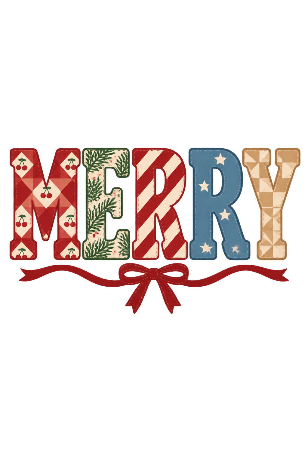
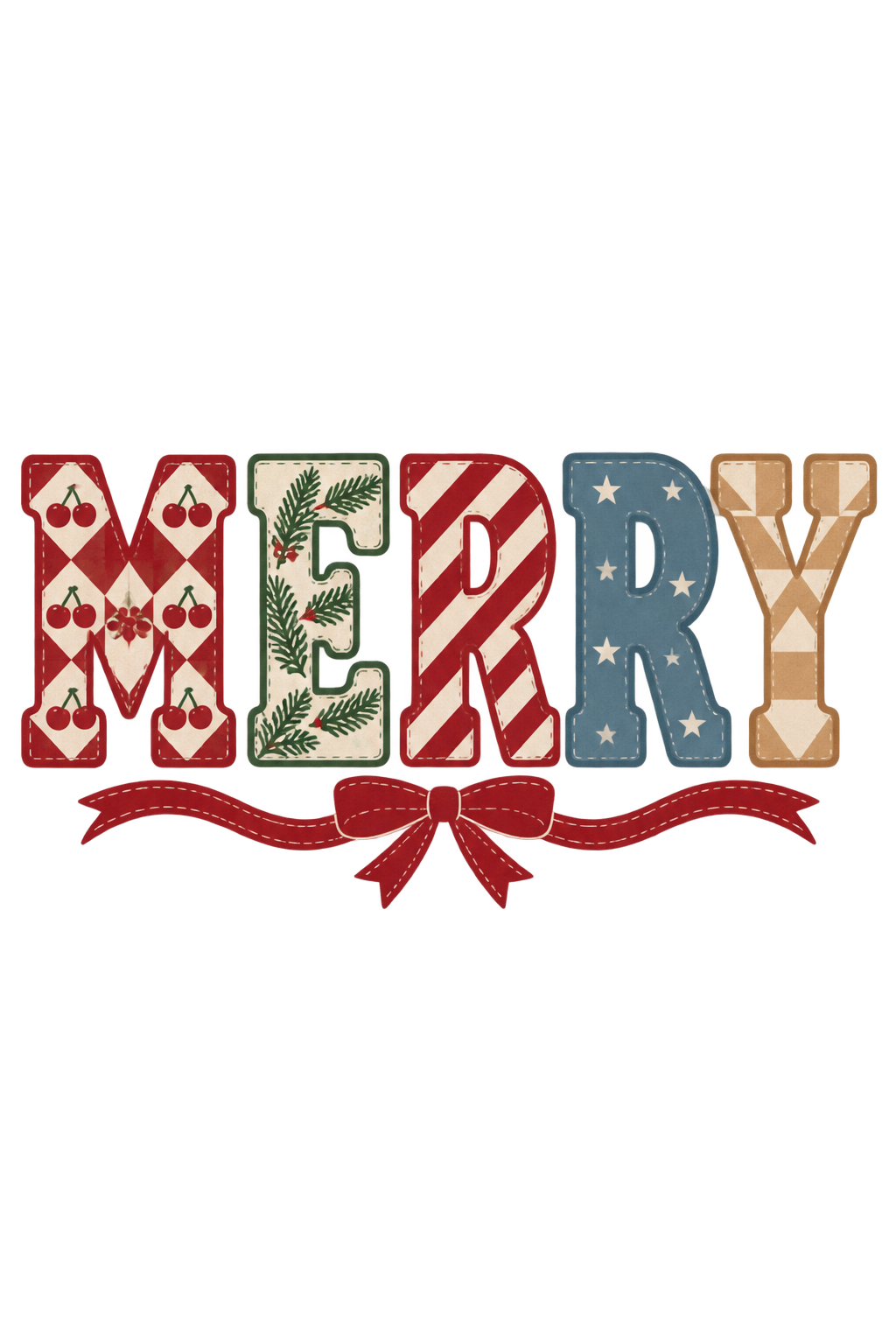
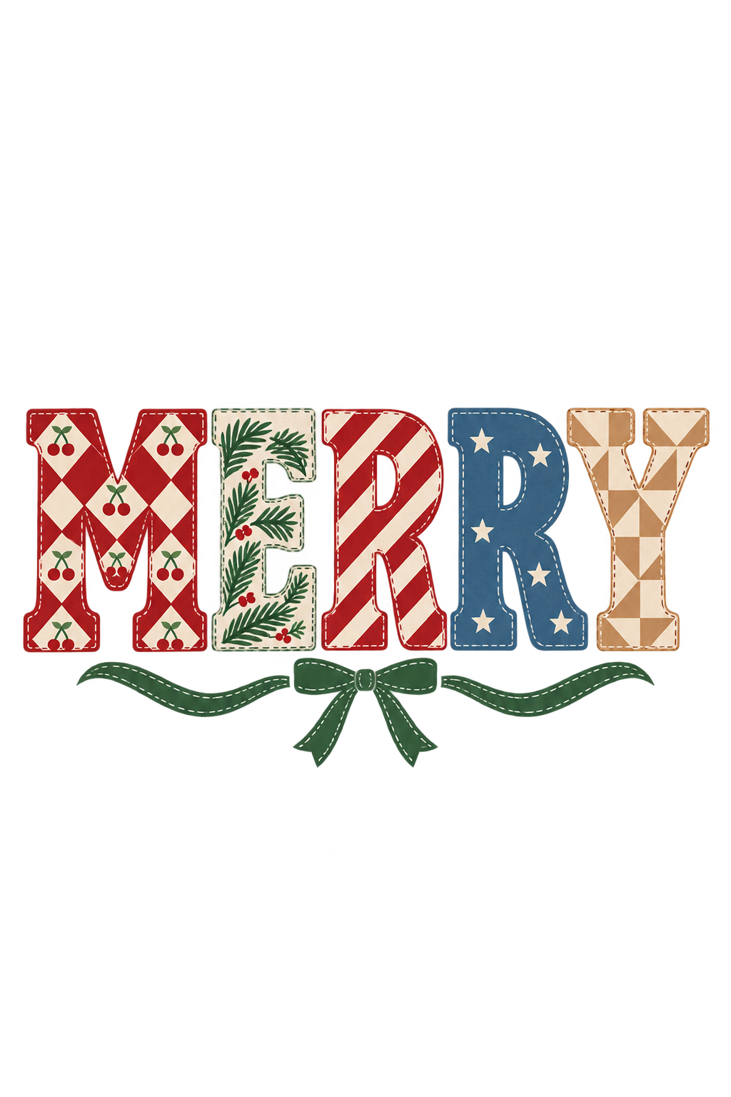
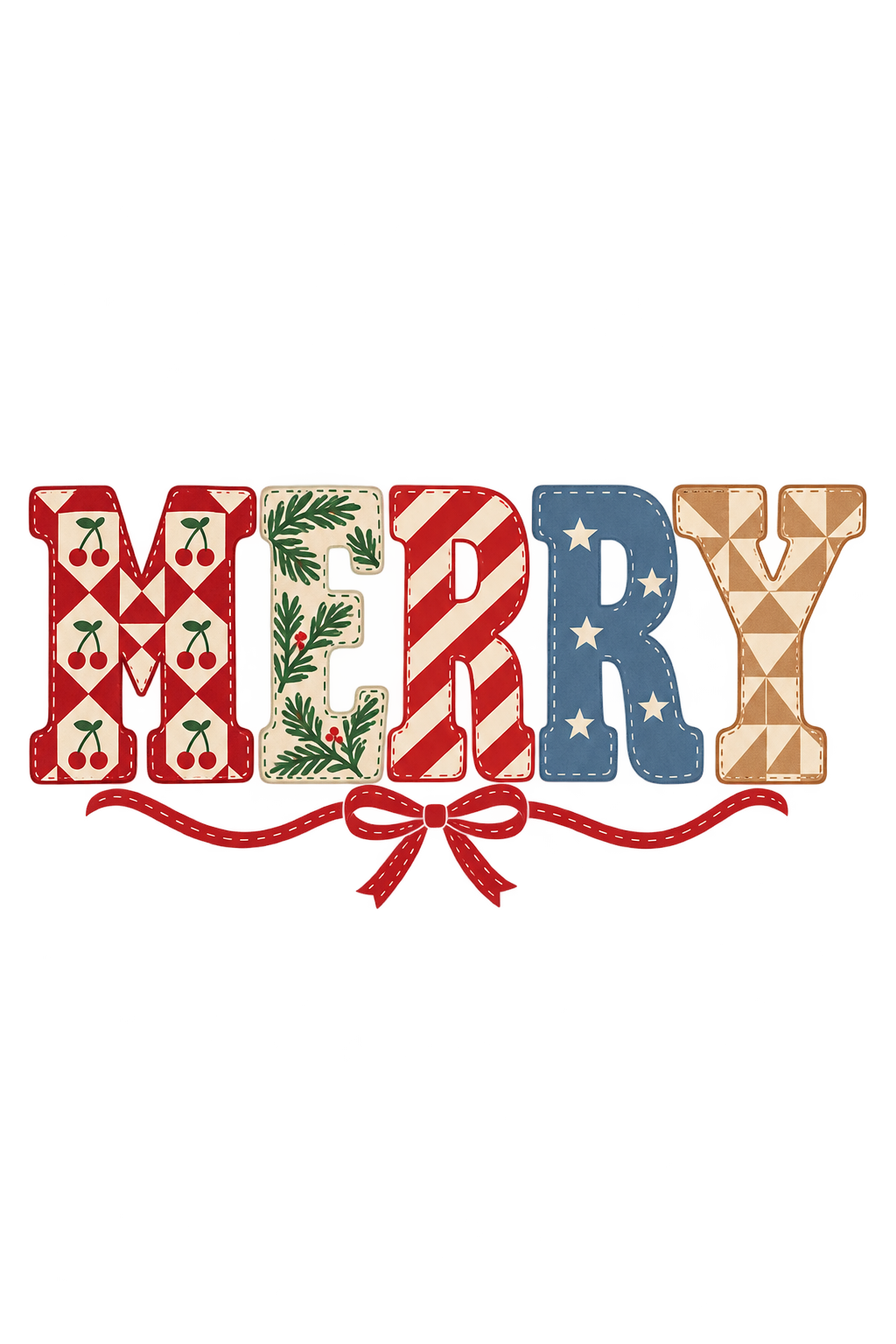
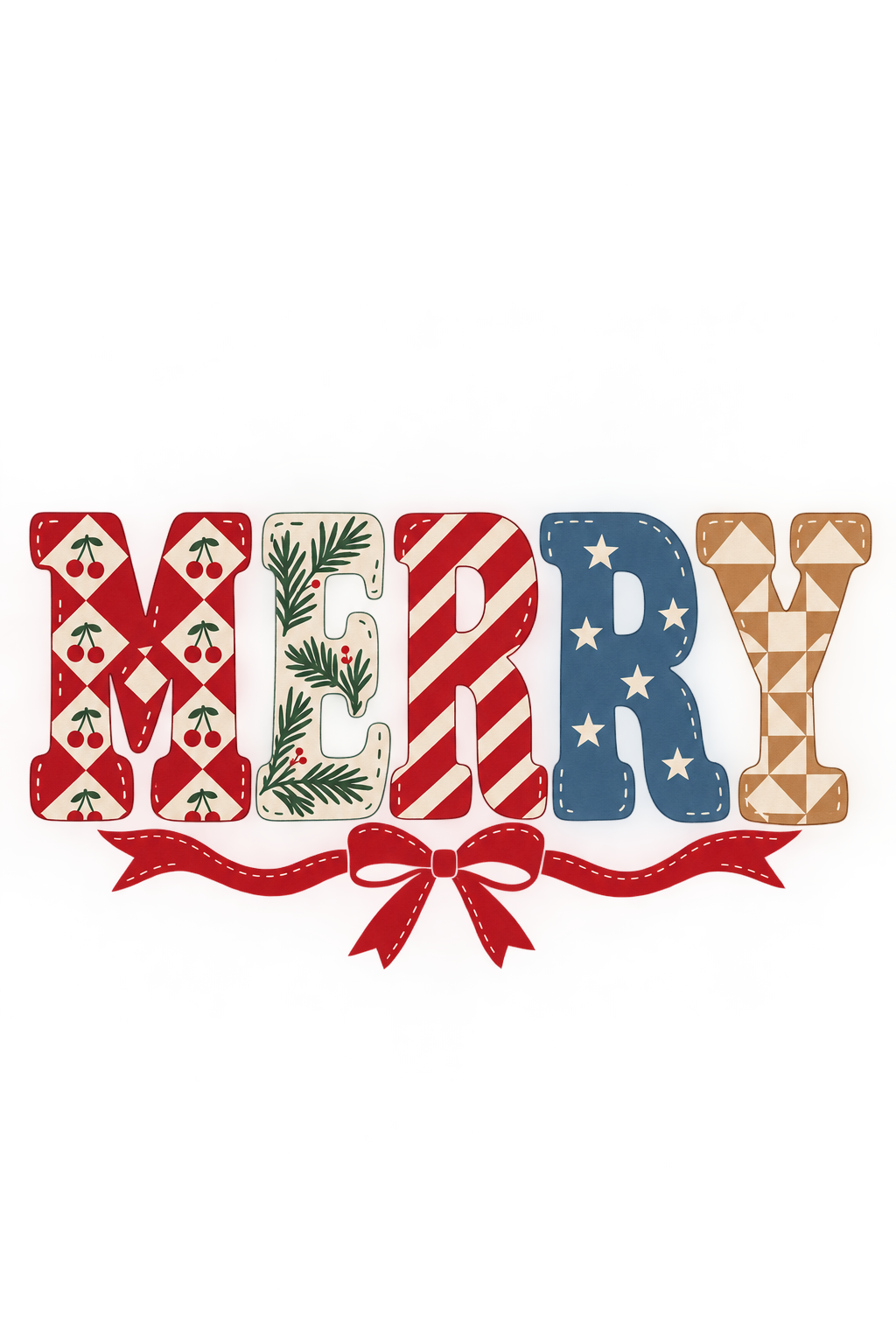
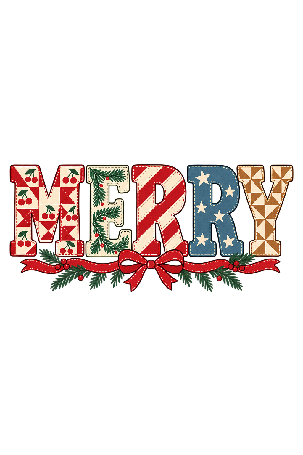
Create one original typographic Christmas apparel graphic with the exact word “MERRY” once and no other wording, intended for a cream sweatshirt. No garment or pattern reference images are attached; use the described original pattern direction below.
Make the letters substantial, custom slab-serif shapes with generous internal counters, clear spacing and a strong overall silhouette. Assign the patterns deliberately: M has a cherry-and-cream quilt field; E has broad evergreen sprigs on cream; the first R has bold peppermint stripes; the second R has a restrained blue field with a few cream stars; Y has warm biscuit-and-cream geometric blocks. Keep each letter readable before adding interior detail.
Use sparse illustrated stitch marks as a printed graphic texture, not a photographic embroidery effect. A small flat ribbon can connect the composition without covering any letter or crowding the counters. Avoid fuzzy edges, dimensional fabric shading and microscopic decorative marks.
Return only the isolated flat artwork on transparency with safe margins. No garment, mockup, extra text, monogram, watermark, sticker border, simulated metallic finish or claims of embroidery.
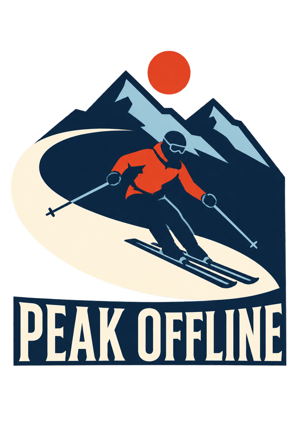
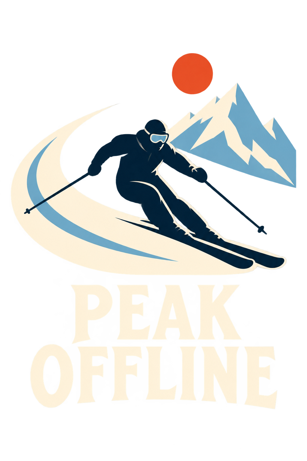
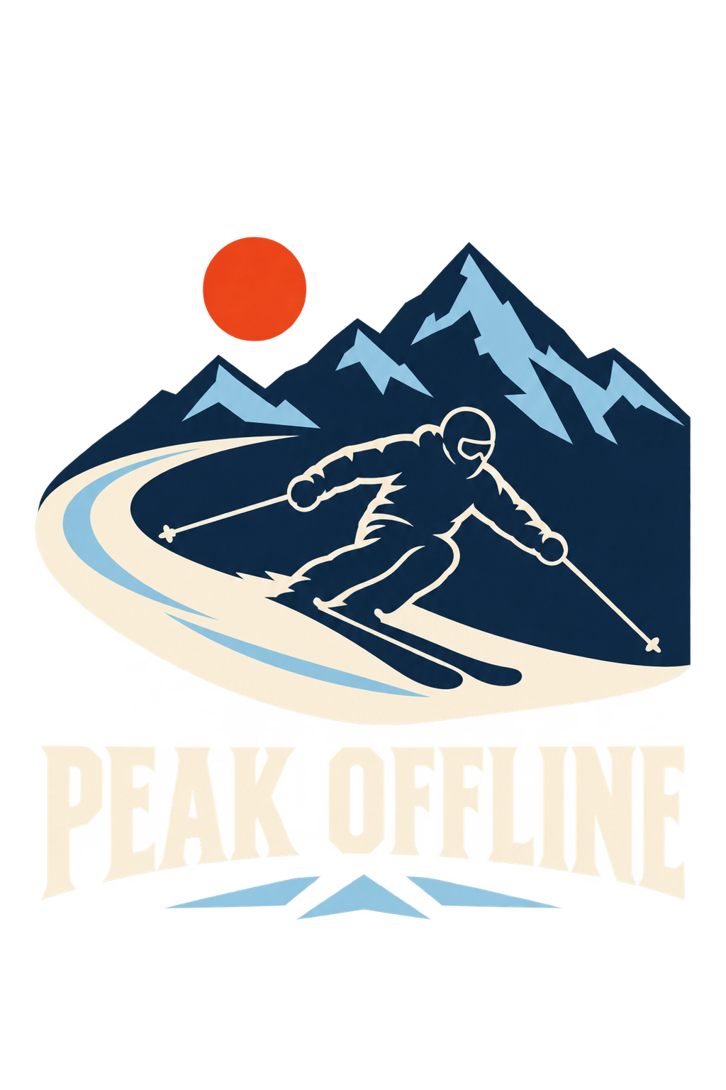
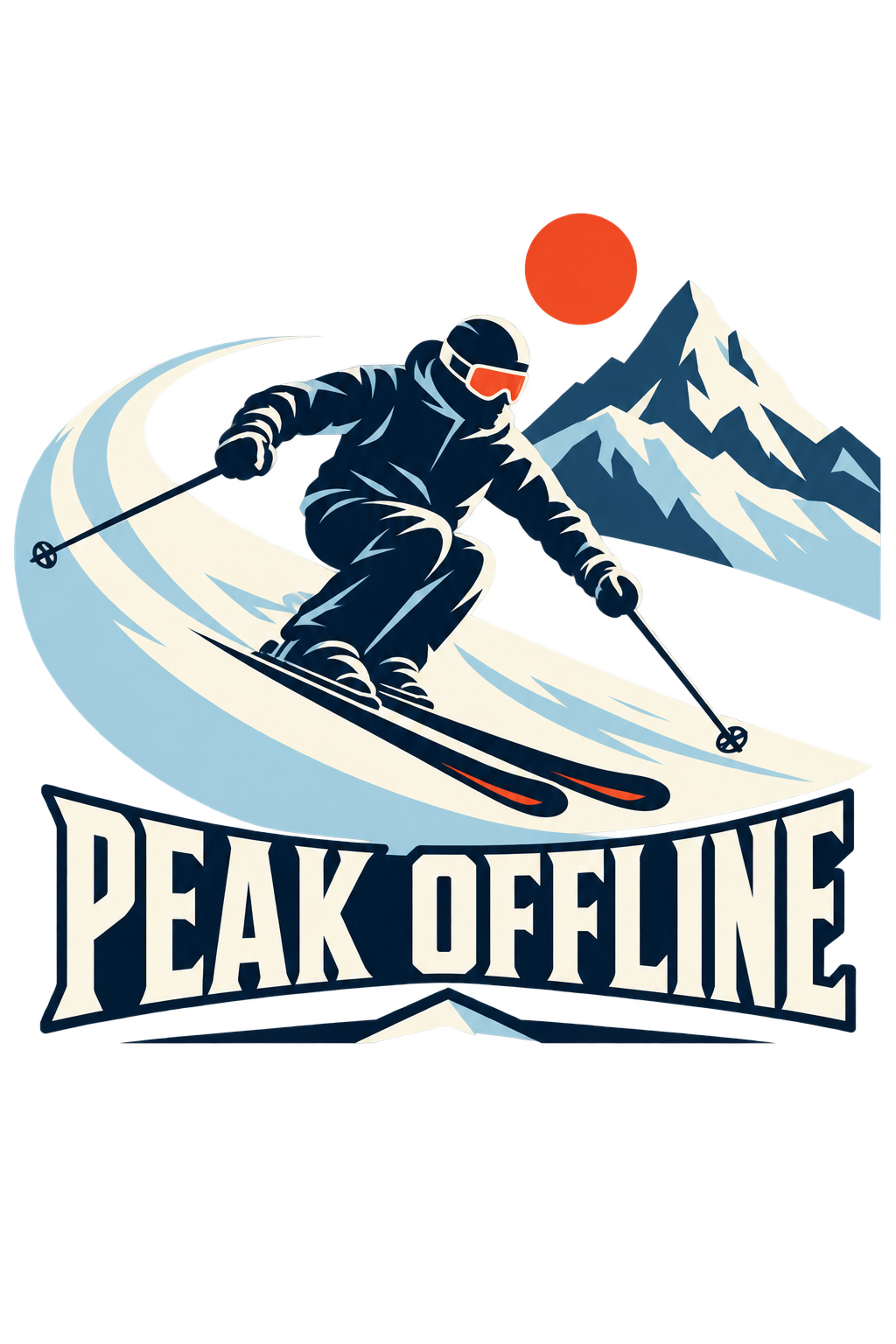
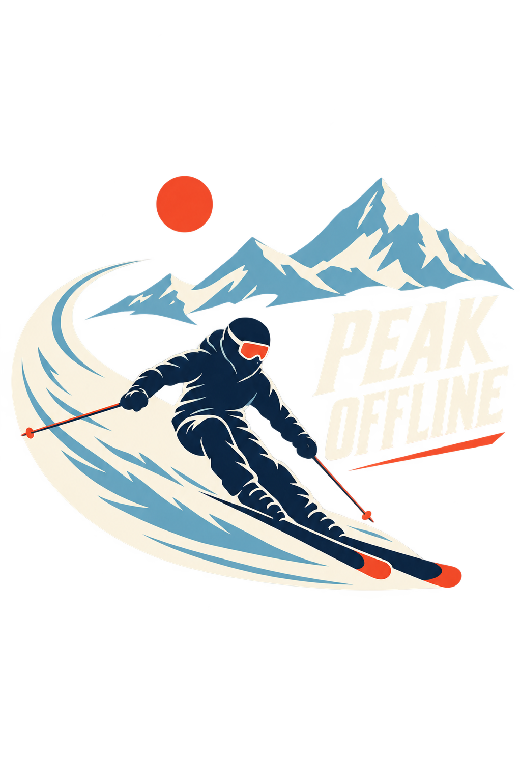
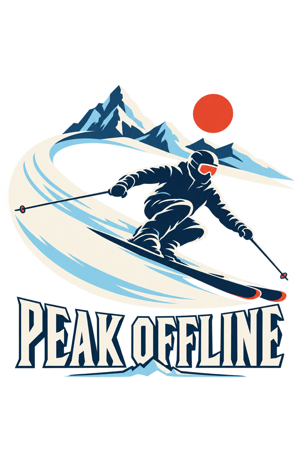
Create one original winter apparel graphic intended for a navy hoodie. No garment photograph is attached; use navy as the intended garment context but do not render the garment.
Compose a single sweeping skier silhouette crossing a broad crescent of snow. Use strong mid-century alpine-poster geometry with a small sun disc and only enough mountain shape to establish the setting. Make the skier's poles, skis and direction of travel coherent. Let large areas of the navy garment show through as intentional negative space.
Use glacier blue, bone and restrained vermilion accents. Keep the visual energy crisp, cold and confident, without distressed badge rings or an entire photographic mountain landscape.
Integrate exactly “PEAK OFFLINE” once in substantial, readable alpine display lettering. No resort name, real destination logo, dates, coordinates or extra slogans.
Return one isolated flat artwork on transparency with safe padding. No hoodie, person modeling clothing, full rectangular scenery, watermark or tiny loose snow specks.
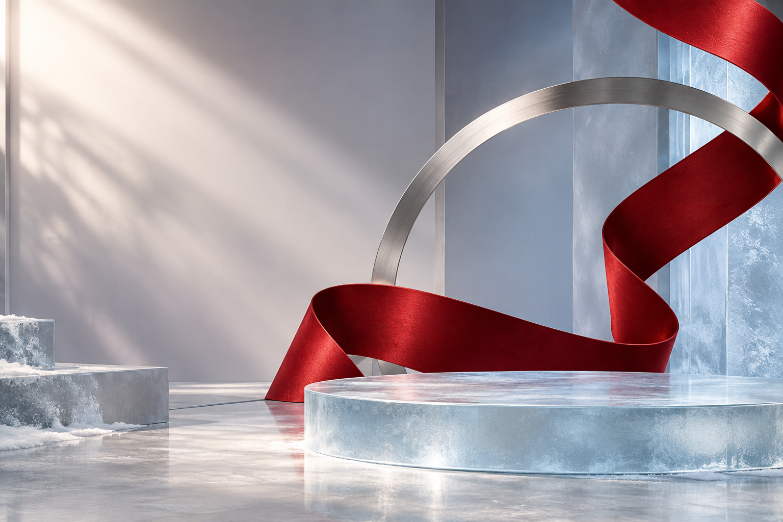
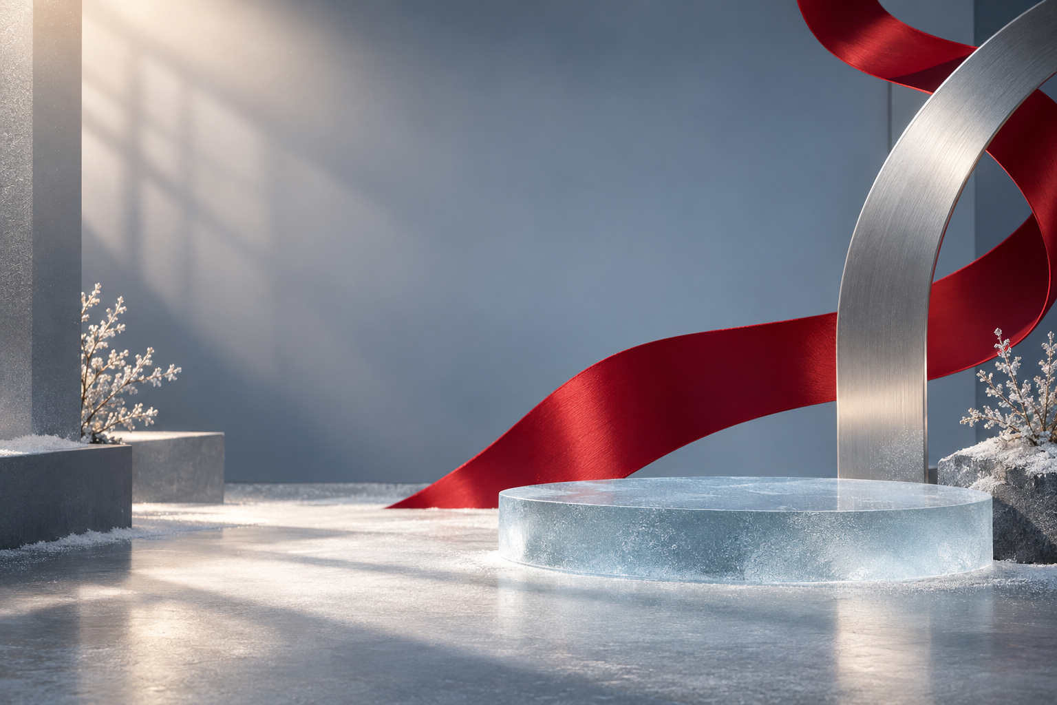
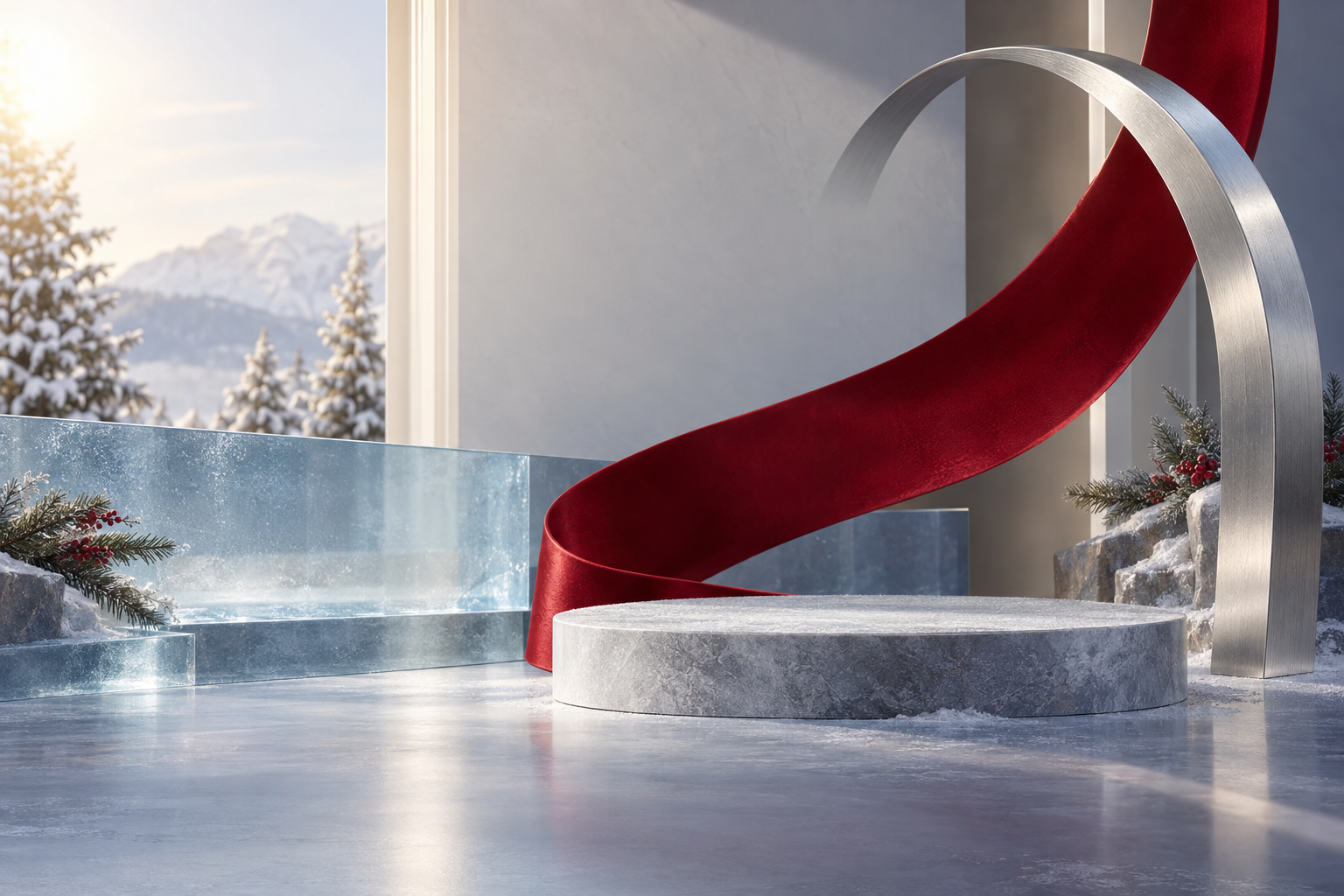
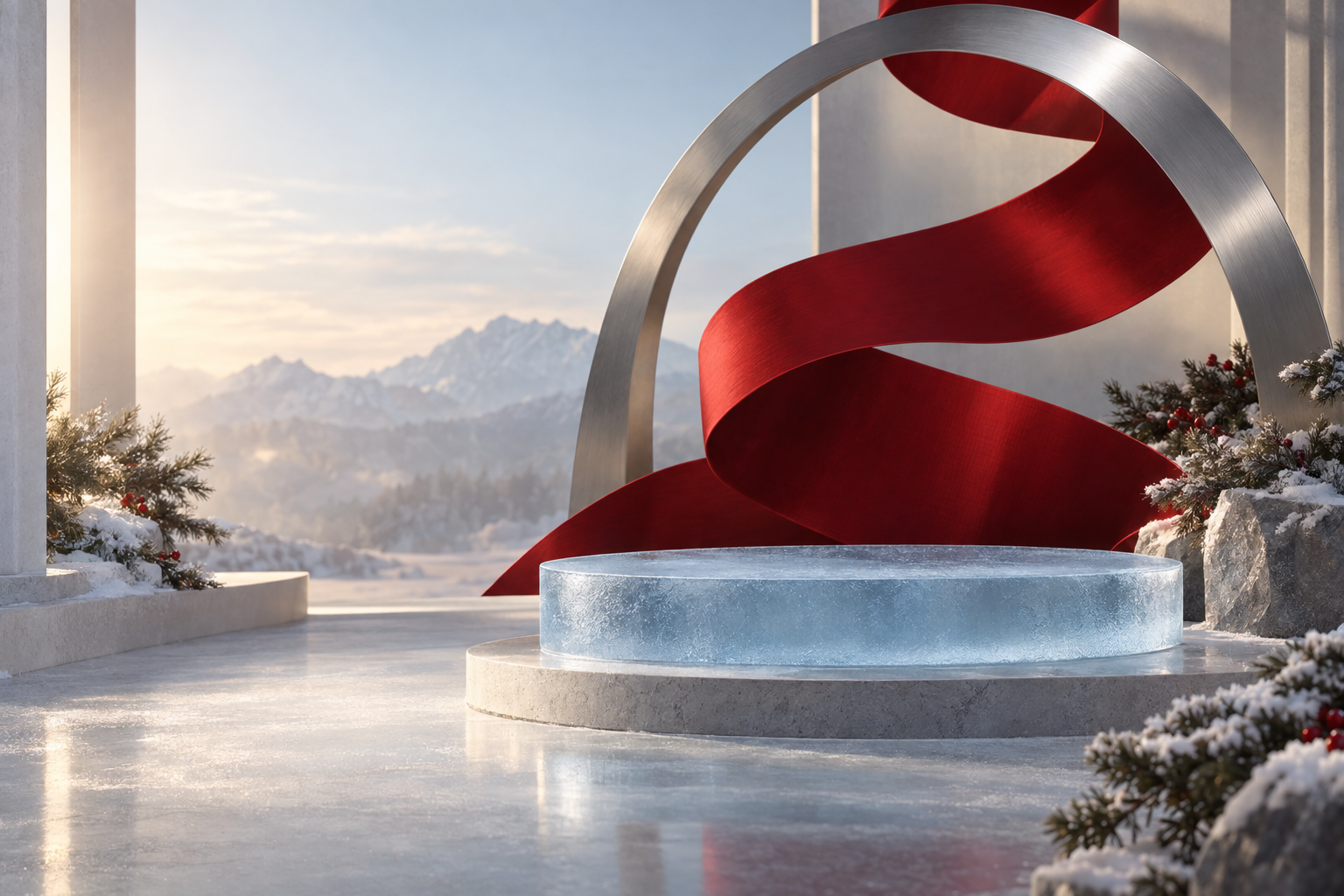
Generate an empty holiday editorial environment for a real apparel product that will be composited later. Do not generate the product itself.
Create a sculptural cherry-red ribbon that sweeps upward behind the planned product position, one restrained brushed-silver arch and a frosted ice-blue glass plane. Use theatrical but believable soft light from the upper left and gentle depth, like a beautifully edited department-store window rather than a crowded holiday display.
Reserve the central-right area for a large real sweatshirt layer. Keep the left third calm enough for a short headline. Make perspective, light direction and contact surfaces coherent. Use broad forms and a premium material contrast instead of confetti or repeated ornaments.
No shirt, mannequin, person, product, logo, text, numbers, price tag, sale badge, watermark or fake UI. Return only the wide empty scene plate. Preserve enough quiet space that the final apparel product will remain the main subject.
Each image is one independent generation using the same prompt and dimensions, with no reference images. These are Ultra Max examples, not UltraRes, an edit sequence, or a speed benchmark. Higher detail will not always produce your preferred result. Previews are optimized for browsing; original PNGs are unchanged. Background controls apply to transparent artwork, not the full scene.
Choose your mode
Signature · Paid plans
Ultra Max Signature
For the careful finishing pass.
Best for
Detailed artwork, small lettering, intricate compositions, and precise editing briefs.
Tradeoffs
Allow more generation time. Always inspect spelling, fine edges, and subject details.
Get a better result
Use a clear reference, name the details to retain, and request one change at a time.
Ultra Max Signature requires a paid plan. Ultra High detail requires a paid plan in both modes; MAX requires Pro or above in both. Check the displayed credit quote before submitting. PNG transparency does not guarantee a production-ready file—review it at the intended print size.
Choose detail and output size
Medium is the default in both modes. Ultra Max retains its detail, resolution, and operation pricing. Ultra Max Signature costs 1.5 times the matching Ultra Max price, except at MAX: Signature MAX costs twice the matching Ultra Max MAX price. The MAX multiplier replaces the 1.5 times multiplier; they do not stack. Check the final credit quote before generating.
Keep HighRes for everyday work, or choose optional UltraRes where your plan allows it. UltraRes fits the available native pixel budget: up to 3840 pixels on the long edge, or 2880 by 2880 for square artwork. Input proportions determine the final dimensions, with small rounding adjustments. Larger outputs and higher detail can take longer; higher settings do not guarantee a better result for every design.
Image Studio · Edit and refine
Keep the design. Refine the detail.
An edit does not have to mean starting over. Work from the version you like, describe one change, and compare the result before moving on. Review every edit: preservation guidance helps, but it does not lock pixels or guarantee identical details.
A repeatable editing workflow
Open your artwork in Image Studio, choose Edit Image, and select Ultra Max.
Keep Subject, Lettering, and Layout selected for details you want carried forward. An explicit change in your prompt takes priority.
Ask for one change: “Make the sun coral red. Keep the wording, lettering shape, and composition.”
Apply the edit. Once accepted, the tools close and the canvas shows whether the job is queued, generating, or saving.
Compare versions. Continue from the result you prefer, or restore an earlier saved version without generating a new image.
Choose precision or speed
Image Studio combines mode, detail, and preservation controls before you apply an edit.
Choose Ultra Max Signature for demanding lettering and intricate shapes, or Ultra Max for faster iteration. Both start at Medium. Signature uses more credits, and detail, resolution, and operation also affect the quote. Review the exact total before submitting.
Mode, detail, and saved-version controls appear where enabled. Settings apply to your next request and do not change a job already queued.
Image Studio edits preserve whether the source is transparent or opaque. Check the result against both light and dark backgrounds. Soft shadows and glows may remain partly transparent.
Use text for Ultra Max edits
Describe the part you want changed in your prompt. Region selection is unavailable for the updated Ultra Max modes while its output quality is being evaluated. Use manual tools when you need exact pixel edits.
Recover without losing your place
Saved versions retain the original and edit lineage. Editing an older version can create a saved branch. If a generation fails, use the recovery action shown and keep its reference ID for support.
In Creative Studio, open an image’s edit action, choose the source output, describe the change, and compare it with its parent or original. Restore the version you want to continue from. Check fine text and subject details after each turn; long editing histories are not a promise of perfect preservation.